If you haven’t yet seen the concept I created, click here
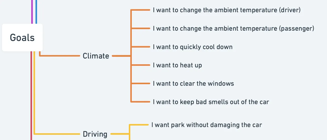
Actions and Goals
Below is the rough design process that I followed.
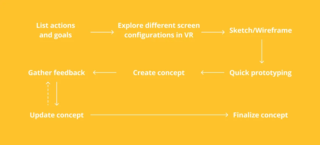
One of the main reasons current car interfaces are complex is the number of features. So to start, I took a step back and evaluated what people actually need in the car and built from there. I started by listing all the features in a typical car and looked at the underlying goals that these features aim to achieve. For example, the underlying goal of increasing the fan speed is to cool down quicker. The result was a list of 20 goals that I used as a basis of the interface.
But in turning these goals into a concrete interface, I struggled to come up with a good basis. In most projects, there is a set of constraints like screen size, graphics performance, timeline, budget, etc. Not having these gives a lot of freedom to create the perfect design from a UX perspective, but it is difficult to get started.
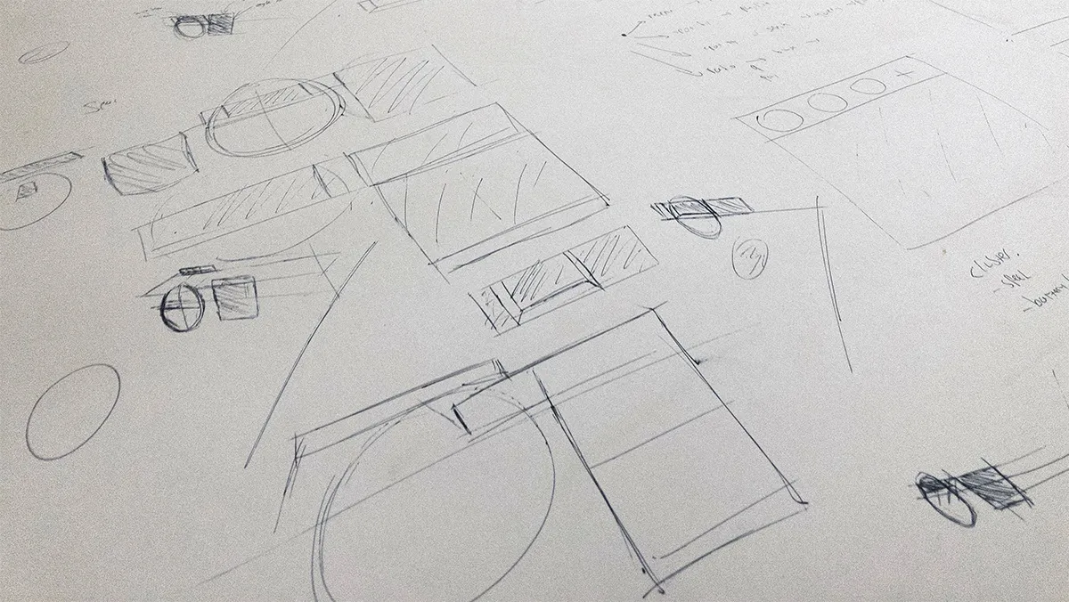
The hardest problem was not having any screen requirements. It is difficult to design an interface for a screen that does not exist. That is why I wanted to narrow the hardware down to at least a screen dimension or layout. I sketched different screen layouts but judging what direction would best is difficult from just a (poor) sketch. So I went a step further.
Exploring Screen Layouts in VR
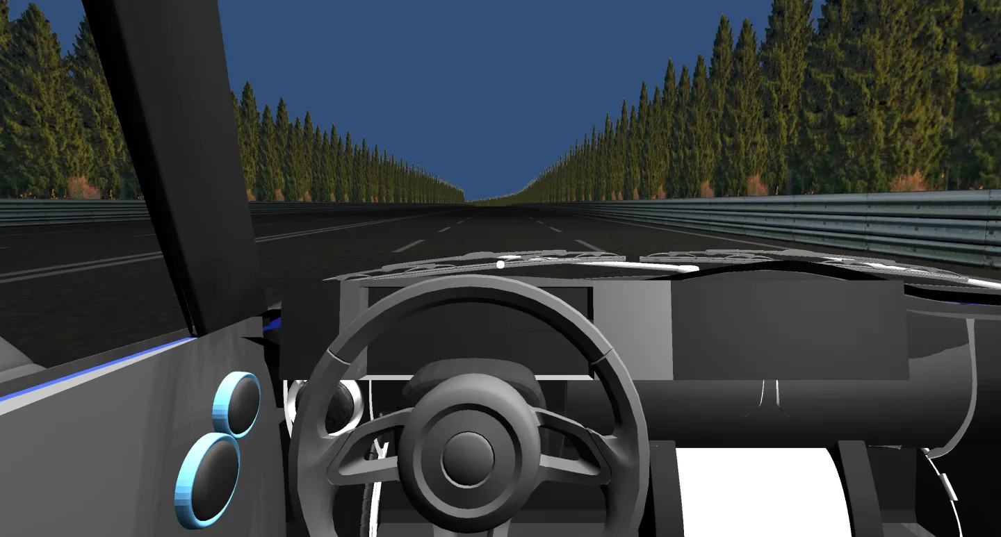
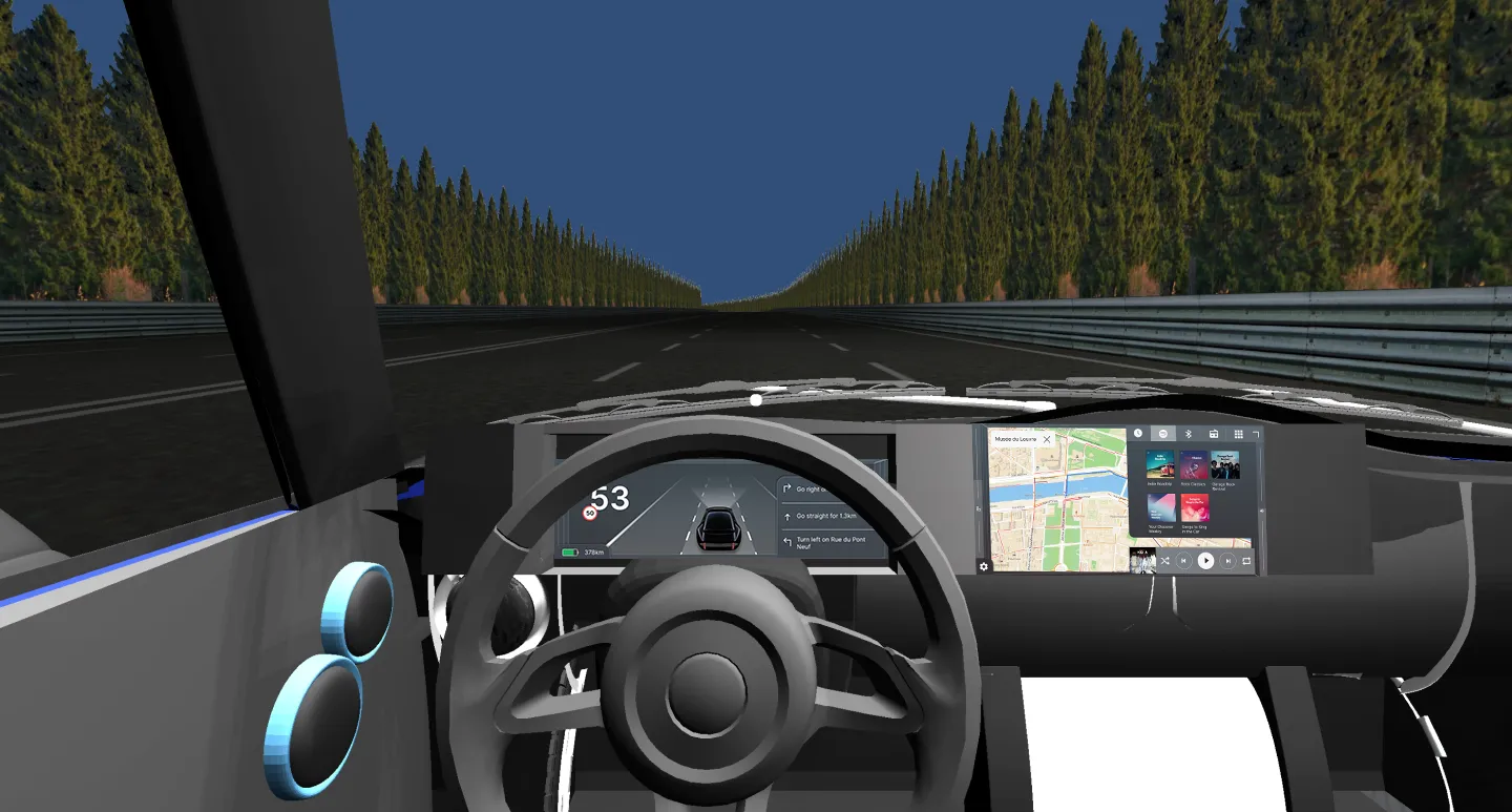
I would have loved to test screen layouts in a real car or a simulator but the Covid-19 crisis made this quite difficult. Virtual reality is the next best thing. I own no VR glasses but thanks to Google Cardboard I could still get close. The goal was to get a general idea of possible screen layouts, not to create an accurate model of an interior layout. That is why I did not want to spend hours creating this.
First, I found a free 3D model of Mini Cooper that included an interior.
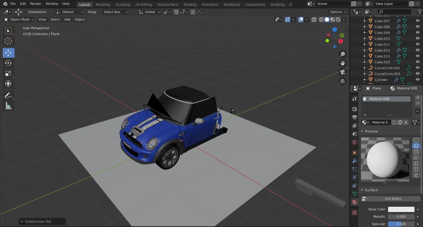
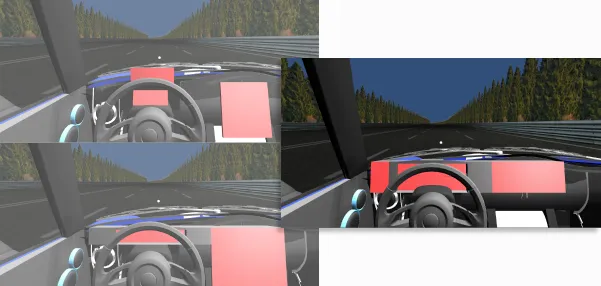
I tore the model apart and created three different screen layouts that I wanted to explore.
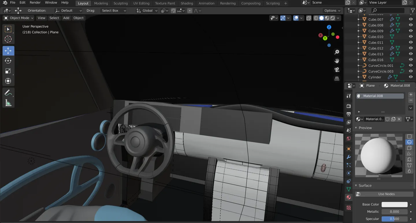
In Unity, I imported the Google Cardboard SDK and modified the default scene. I imported the Mini and downloaded a free road asset.
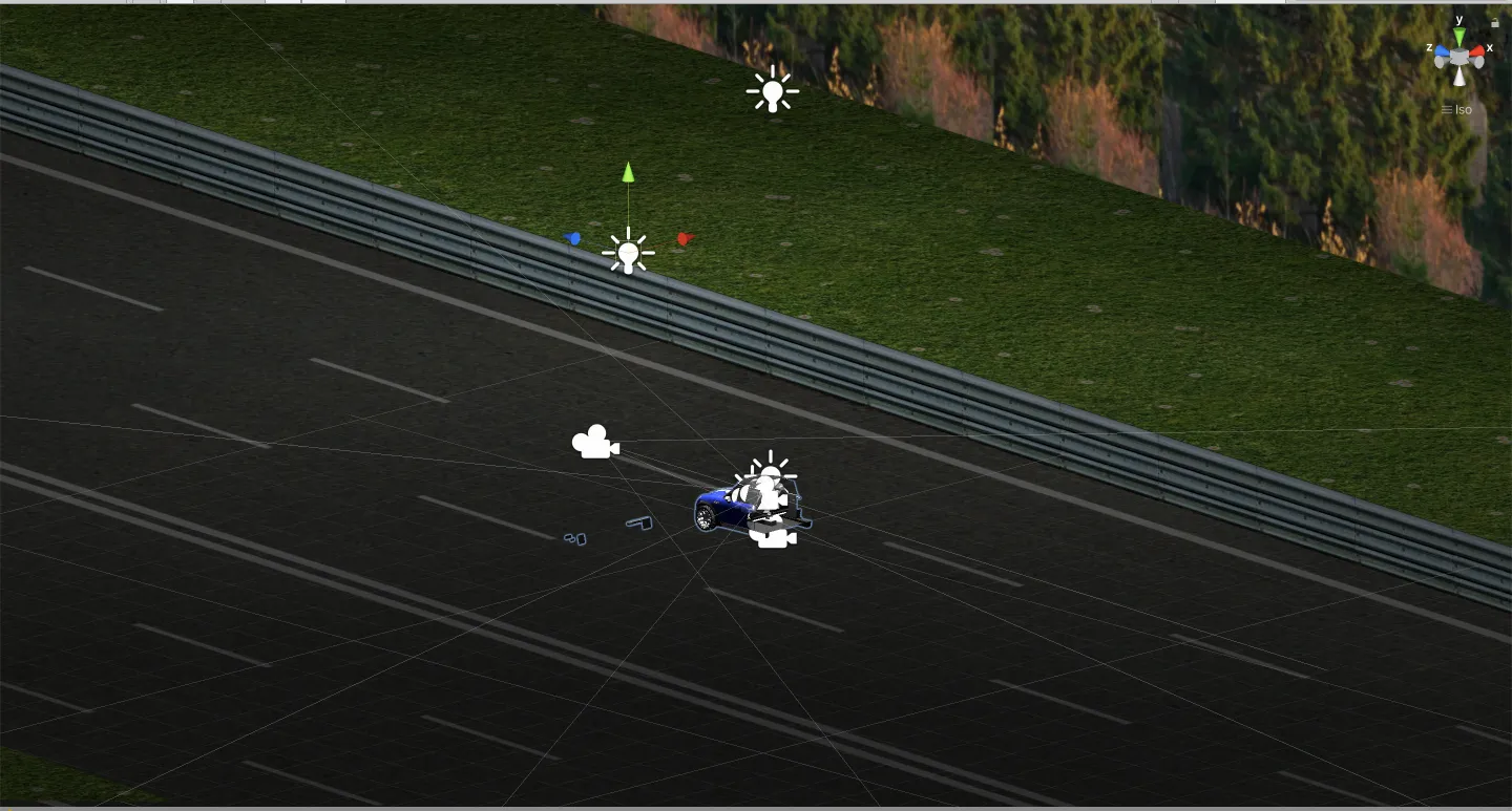
In less than an hour, I set up everything and was exploring the scenes in virtual reality.
The three different screen layouts were chosen to be quite different from each other, based on current directions of car companies. I found that having the display as close to the line of sight of the driver to be the least distracting. Therefore, a horizontal layout with a small screen height would be optimal.
Sketching and Wireframing
After having established a direction for the screen size, I had less difficulty turning the goals into abstract interfaces. Some basic things I figured out early on was to group functionalities. I created a group for media, climate controls, and navigation.
Another core idea was that I wanted users to achieve their goals with as few clicks as possible. I made some simple layouts based on a system of resizable windows. My idea was that having everything present on one 2D layer would be as simple as possible and minimize the number of clicks.
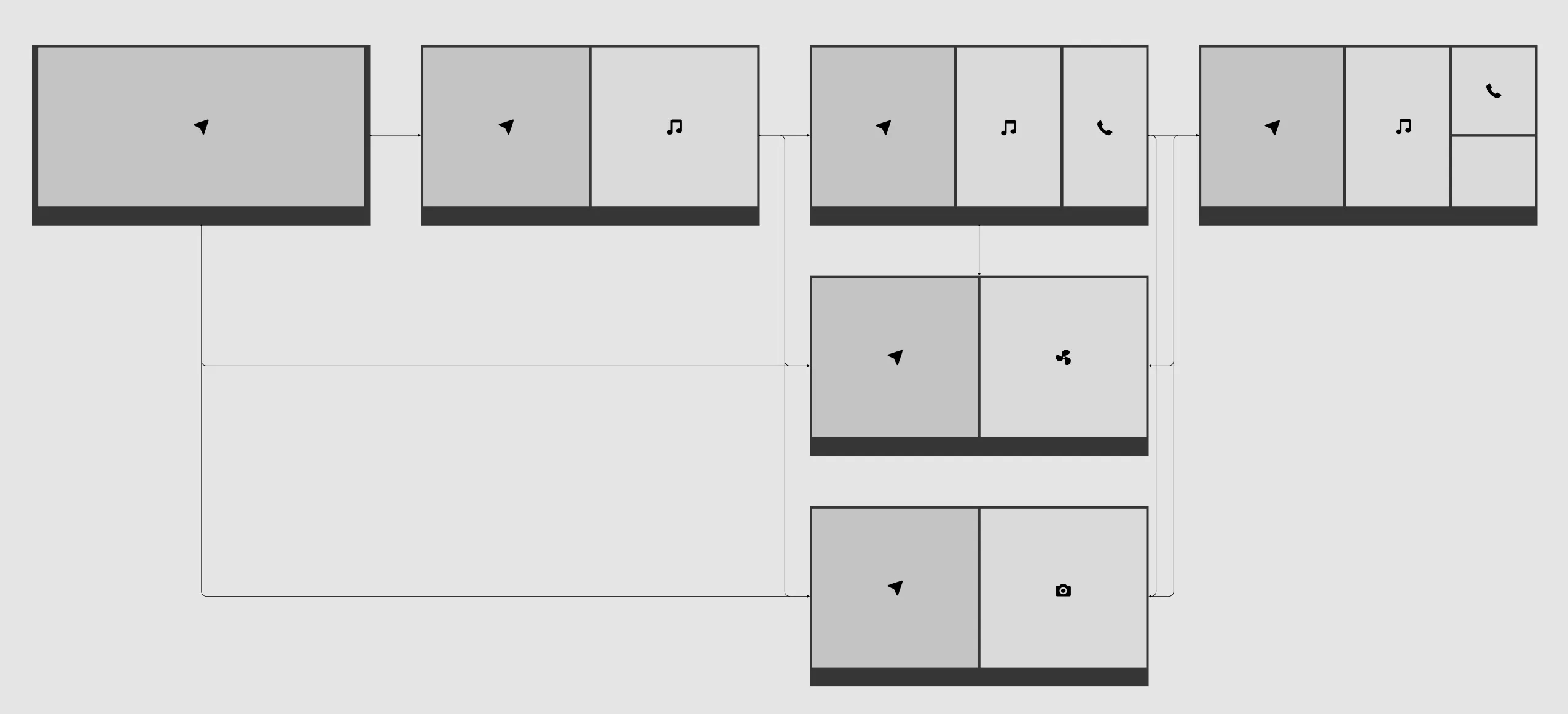
I then created sketches and wireframes for each independent group. At the same time doing minor adjustments to the screen layouts.
Quick Prototyping
One big obstacle was figuring out what to do with the direct controls like volume. I came up with an idea based on a previous concept where I explored gesture interaction in cars. To get a more concrete idea of how it could work, I built a very basic interactive prototype using Axure. Clicking and holding on the edge of the screen shows an overlay. By scrolling to the preferred position and releasing, the setting is selected.
While playing around with this, I thought it had potential so I integrated it in the first version of the concept.
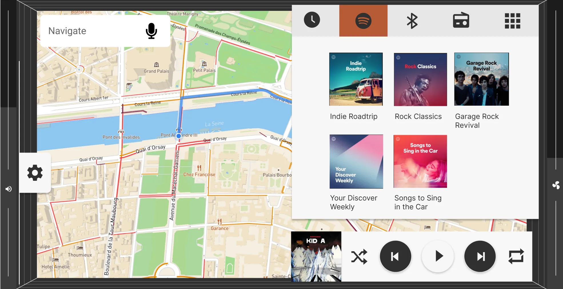
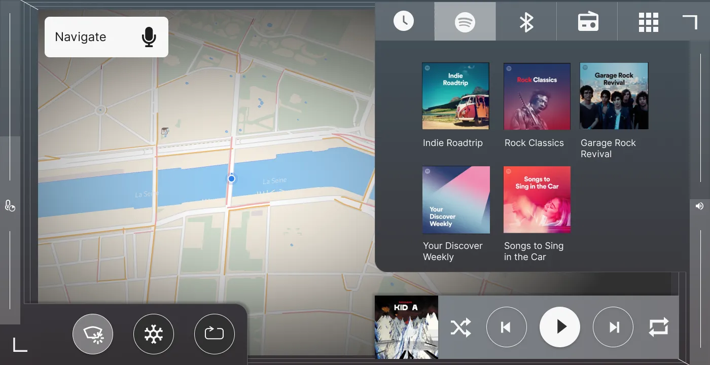
The First Iteration
The first concept was pretty basic. It had a menu bar at the bottom of the screen with navigation, media, climate controls, and camera. The navigation would always cover the left half of the screen and the other functionalities the right half. It was also possible to enter full-screen mode with each menu item. I also added some basic visual design to make it come to life.
I designed everything in Figma and used After Effects to create two animations of the gesture interaction. One for the volume control and one for setting the temperature.
Feedback
I reached out to experienced designers in the automotive design field for feedback on this concept. From those conversations, three great points of improvement were clear.
Working with resizable windows is quite restrictive. If instead of windows, layers are used, there is much more freedom and space for the interface.
The second point concerned the functionalities of the system which in the first concept were quite broad. Instead, when you think of it, while driving, you only need navigation and media. So these should be the basis of the system and the rest is additional. In this concept, all functionalities were made equally as important.
The last great advice is that this concept is quite conservative. It is designed for cars that are on the market now. While in the automotive world, designers work 3-4 years ahead due to the long development cycles. So I should not be afraid to create newer concepts, work with different screens at the same time, and look at what the user experience could be 3-4 years from now.
The Second Iteration
For this version, I implemented the feedback and focussed much more on navigation and media. I also wanted to see if I could design around using a menu bar and create a more natural interaction. So I tried to convert the menu bar into a 3D layered system where each layer in the three-dimensional space would correspond to a drive mode.
The highest layer would be ‘commute’ which shows media, climate control, and navigation. This is followed by the ‘navigate’ mode, which is centered around navigation. And last, there is a focus mode, which shows a minimal interface. Each step corresponds to a similar cluster interface. The user can cycle through the modes with a button on the steering wheel or by interacting with the center screen.
A problem I ran into was that there was no space for climate controls. I came up with an idea to separate the controls and place them on separate screens. By doing this, the center screen interface was much simpler which helped the usability of the whole system.
Feedback
I already noticed while playing around with this concept that I introduced a lot of unnecessary complexity. The same came out of my conversations with other designers. The basic idea of using layers combined with driving modes is interesting but too complicated. An ideal solution for this would be to mix the first and second concepts.
Another great point is that the interface looks quite messy with these layers. So in the final concept, I needed to find a visual style that minimizes this and makes it look much cleaner.
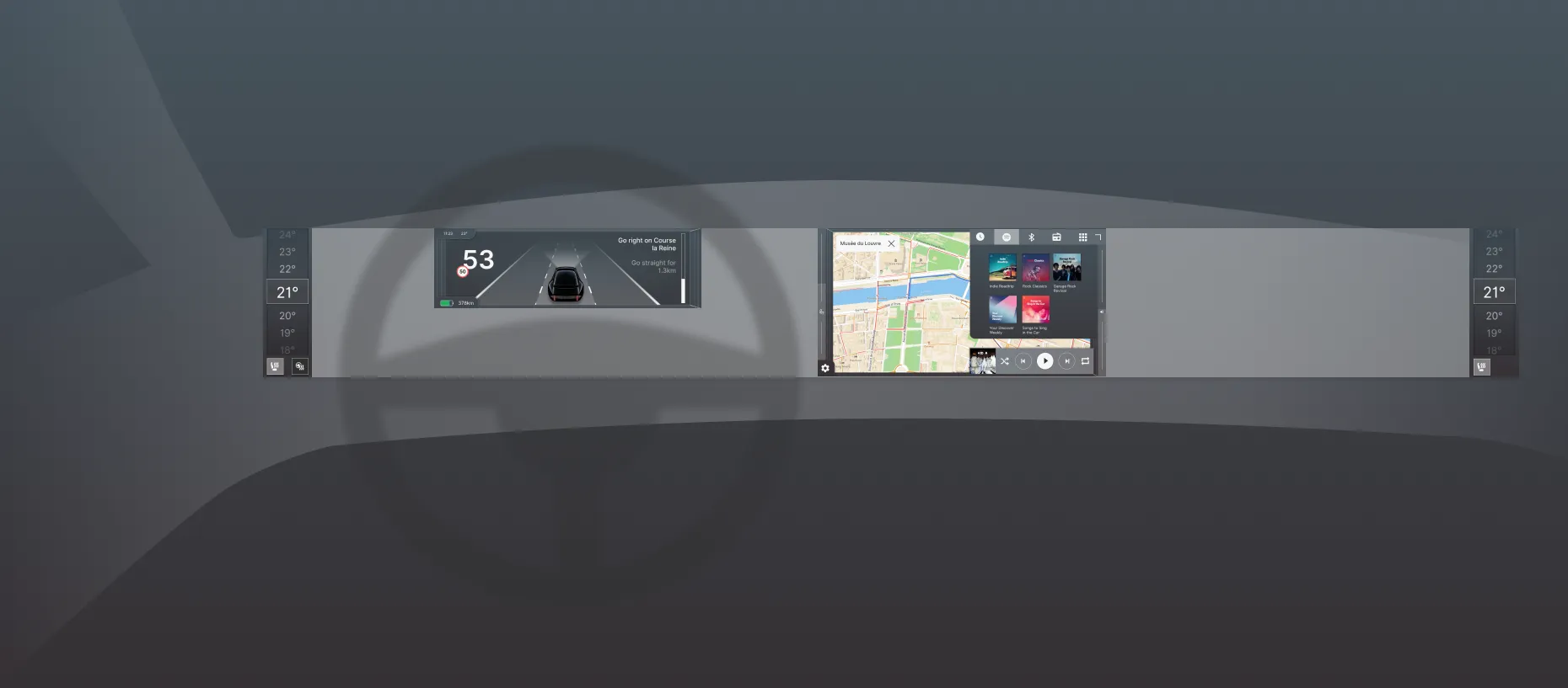
The Final Iteration
For the final version, I removed the interaction of cycling through different driving modes. I wanted to keep the idea of a focus mode. So instead of cycling through driving modes using 3D layers, I placed the two main controls in the corner of the screen and let the user decided what he wanted to display.
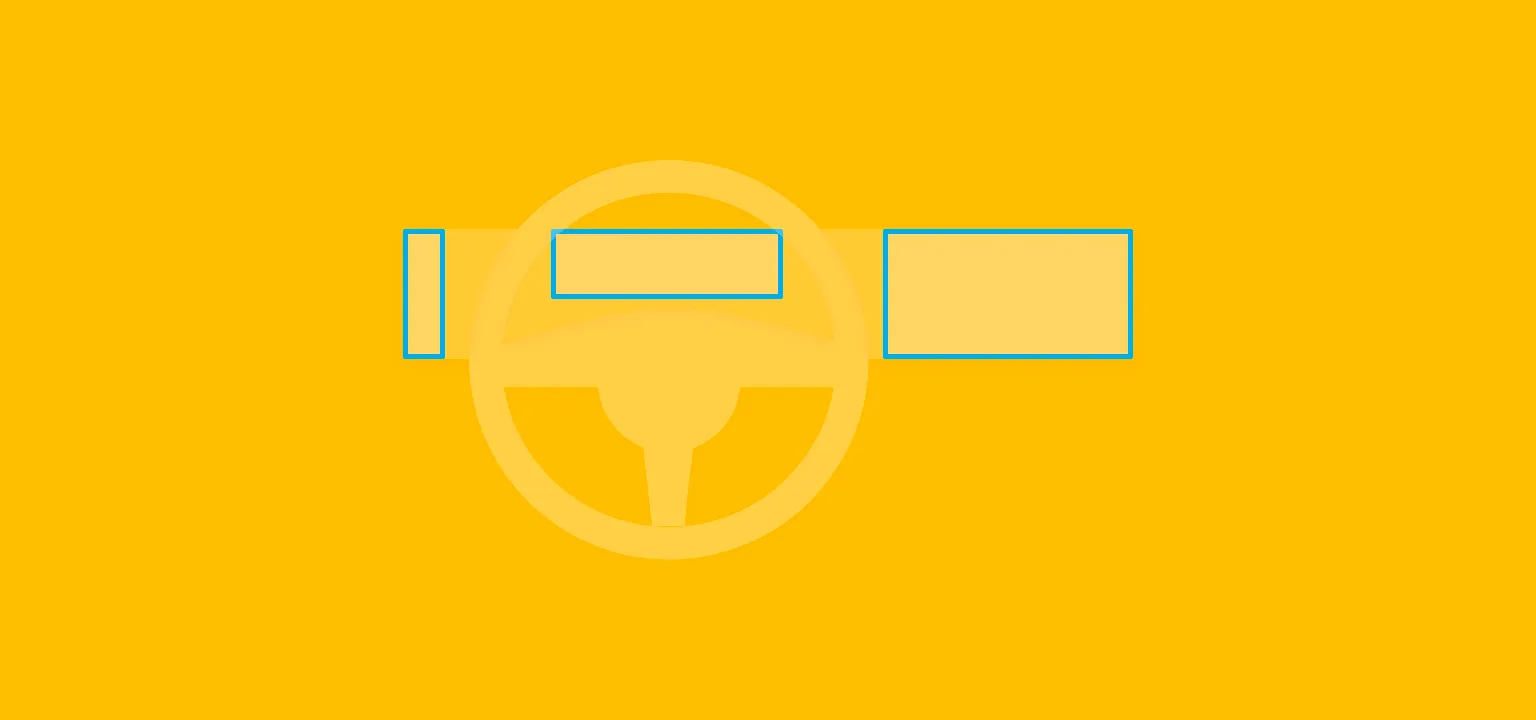
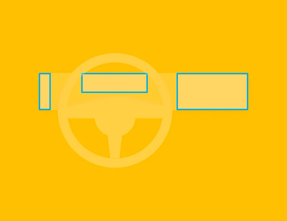
Last, I tested the concept in virtual reality to see how reachable the controls are. I had a concern that the media button would be placed too far away from the driver for comfort. After trying it with Google Cardboard I noticed this was not the case. However, the 3D model I used was a Mini Cooper which has quite a small interior. In a large SUV, this would still be a problem. So this will be something to improve for the next version.
I also created a calmer visual design for the interface which helped to reduce the messy look of the layers.
The result is the concept I wrote about in my previous post. As a project like this is never completely finished, I will always keep working on it and updating it. I have been receiving great comments and feedback from many readers which will help a lot in improving the concept! So if you have any comments, I am happy to hear them!
Get notified of new posts
Don't worry, I won't spam you with anything else