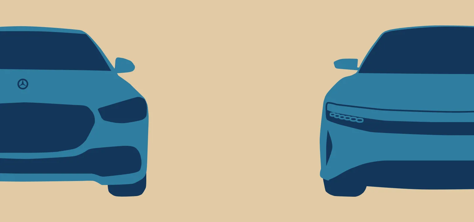
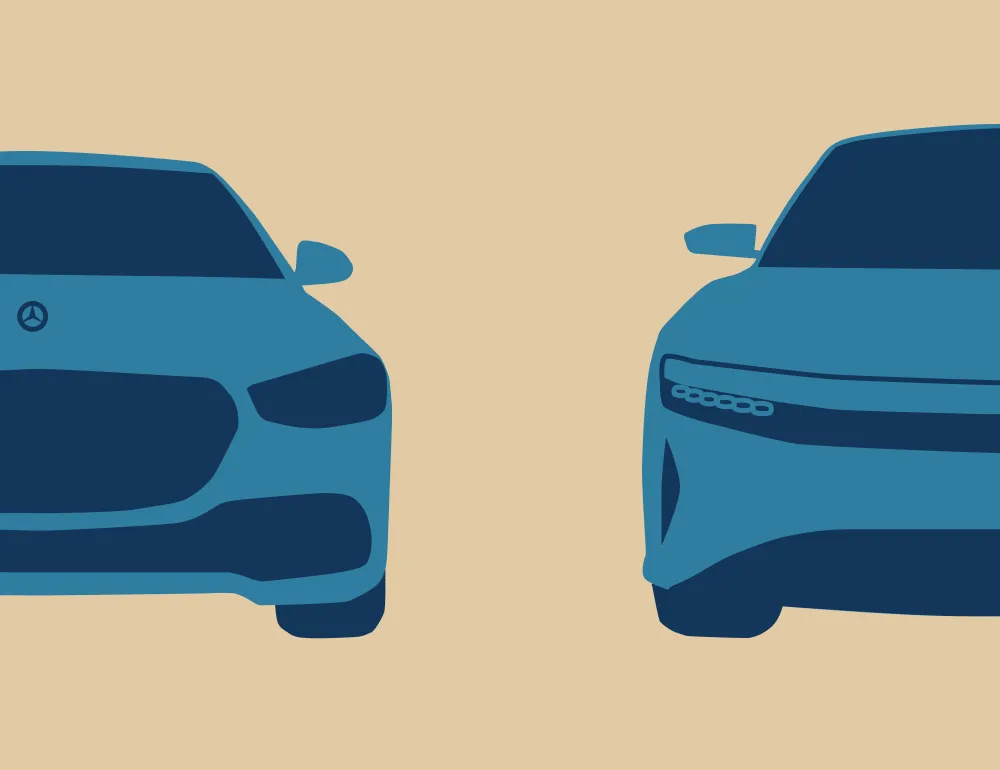
Mercedes S-Class
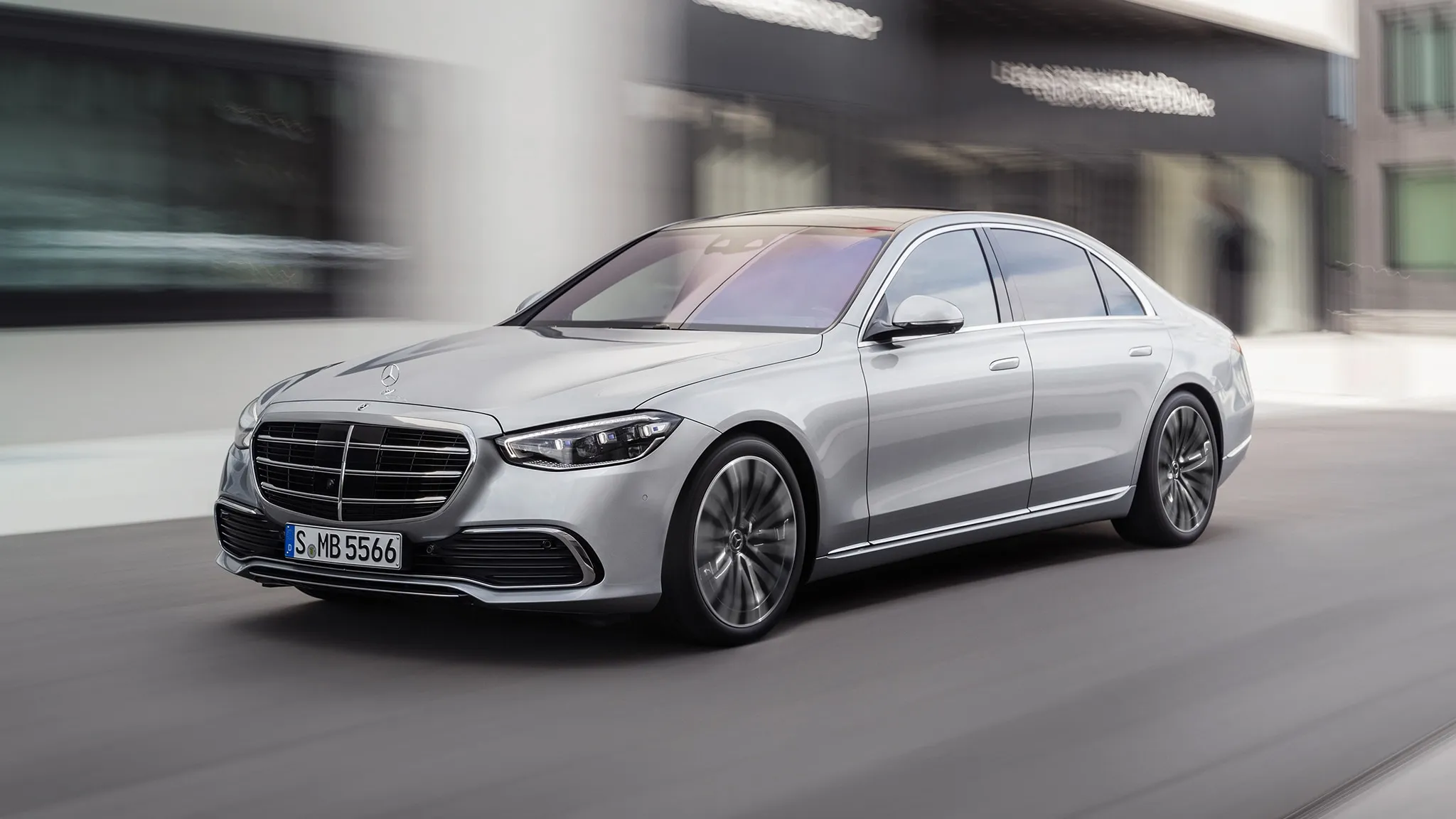
With each launch of a Mercedes S-Class, the whole automotive world watches. It is a prelude to the technologies that will be the industry standard 10 years from now. Features like adaptive cruise control, ABS, and full LED lights all debuted on the S-Class. Innovation and luxury go hand in hand at Mercedes and design highlights this.
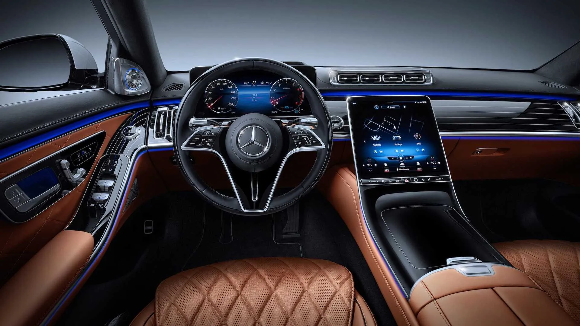
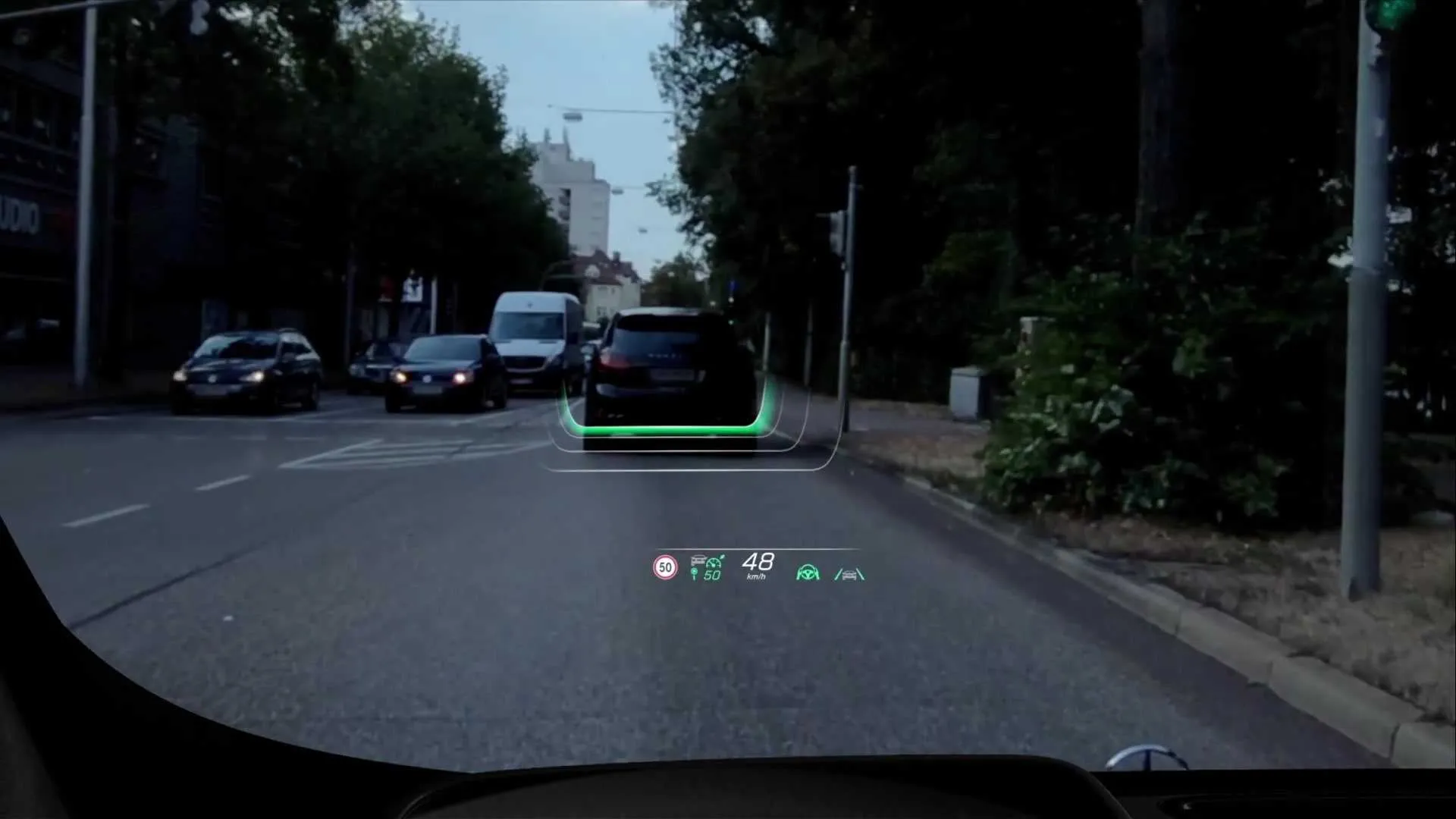
The 7th generation S-Class comes loaded with new display technologies. It has an OLED center screen, a 3D instrument cluster, and a head-up display with augmented reality.
MBUX, Mercedes’ infotainment system, received a big update to suit all these displays. The first thing you notice is how different it is from the typical touch interfaces like iOS and Android.
The first difference is the use of 3D. Today, 3D is rare in touch interfaces since flat design is the standard today. Anything that does not follow general design trends is often seen as outdated or ugly. It is brave of Mercedes to go down this road. To succeed, they have to create a distinct, modern 3D style that fits their design philosophy around innovation.
Having said that, on first look, it seems like they haven’t succeeded. The UI consists of a mix of outdated design trends paired with some flat design.
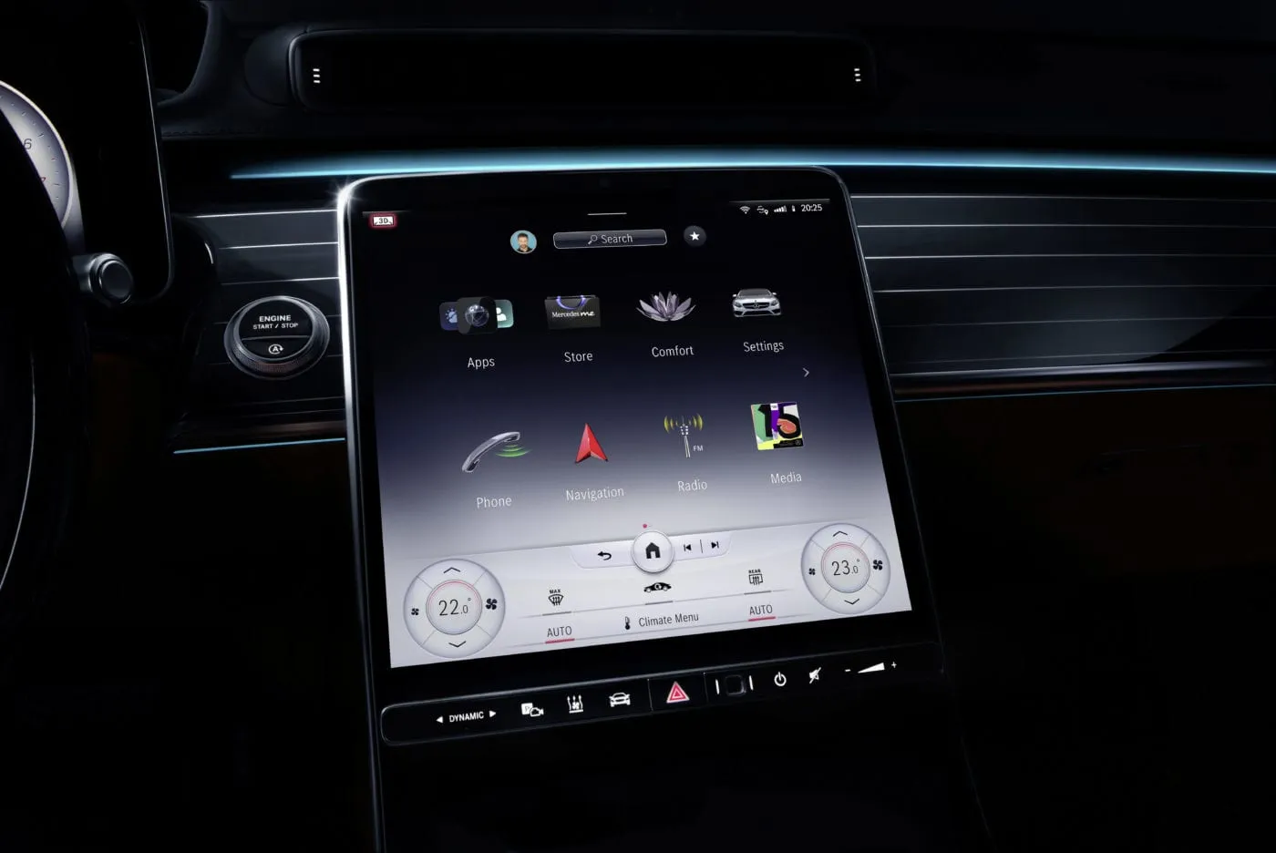
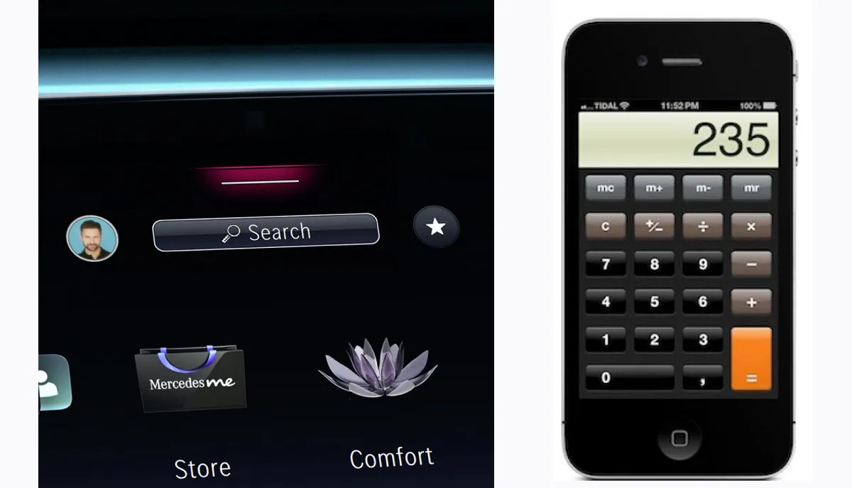
Take the main screen as an example. The search button at the top has gradients like the typical skeuomorphic design from the first versions of iOS.
Other buttons in the main menu screen are flat. While the icons are a mix of the two styles. The subject of the icon is inspired by flat design. It is an abstract symbol of the function it represents. But displayed in skeuomorphism, so turning the abstract subject into a real object. The end result is a bit weird…
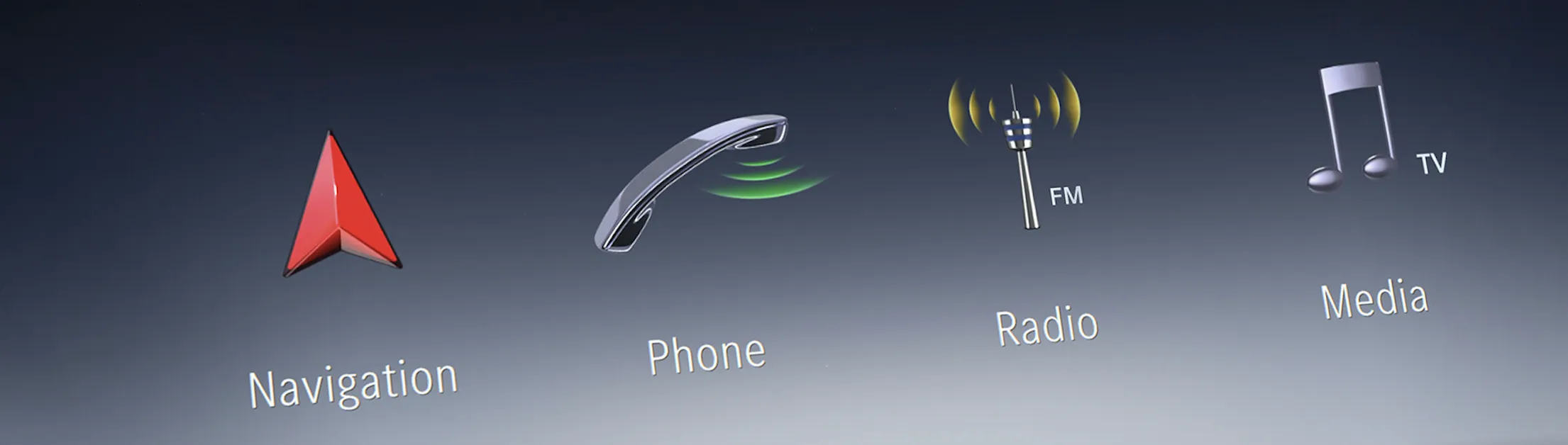
To represent the driver’s phone, an old, shiny office phone is used instead of a modern smartphone. Something that looks like an air traffic control tower emitting waves represents radio. Mercedes apparently also thought that was unclear so they wrote ‘FM’ next to it. Then the media icon, which is the typical musical note, but with ‘TV’ written next to it. I also don’t know why.
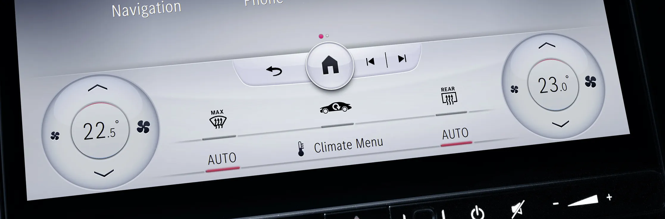
For other functions like the climate controls, this mixed style works better.
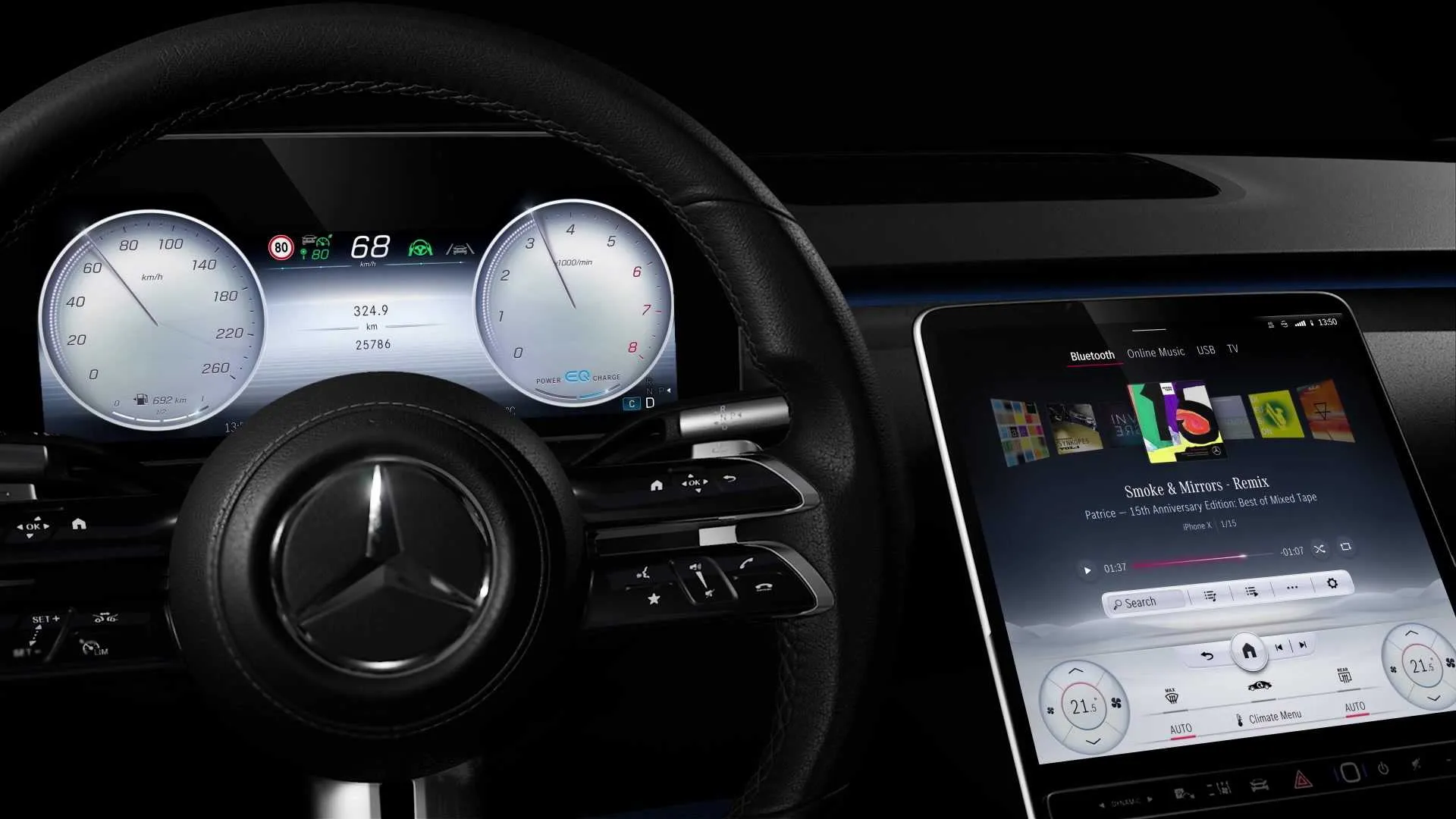
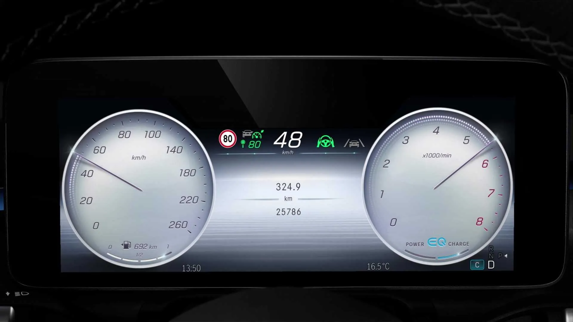
This concept of making digital UI elements look like their physical predecessors is a clear design choice. The gauges are a good example of that:
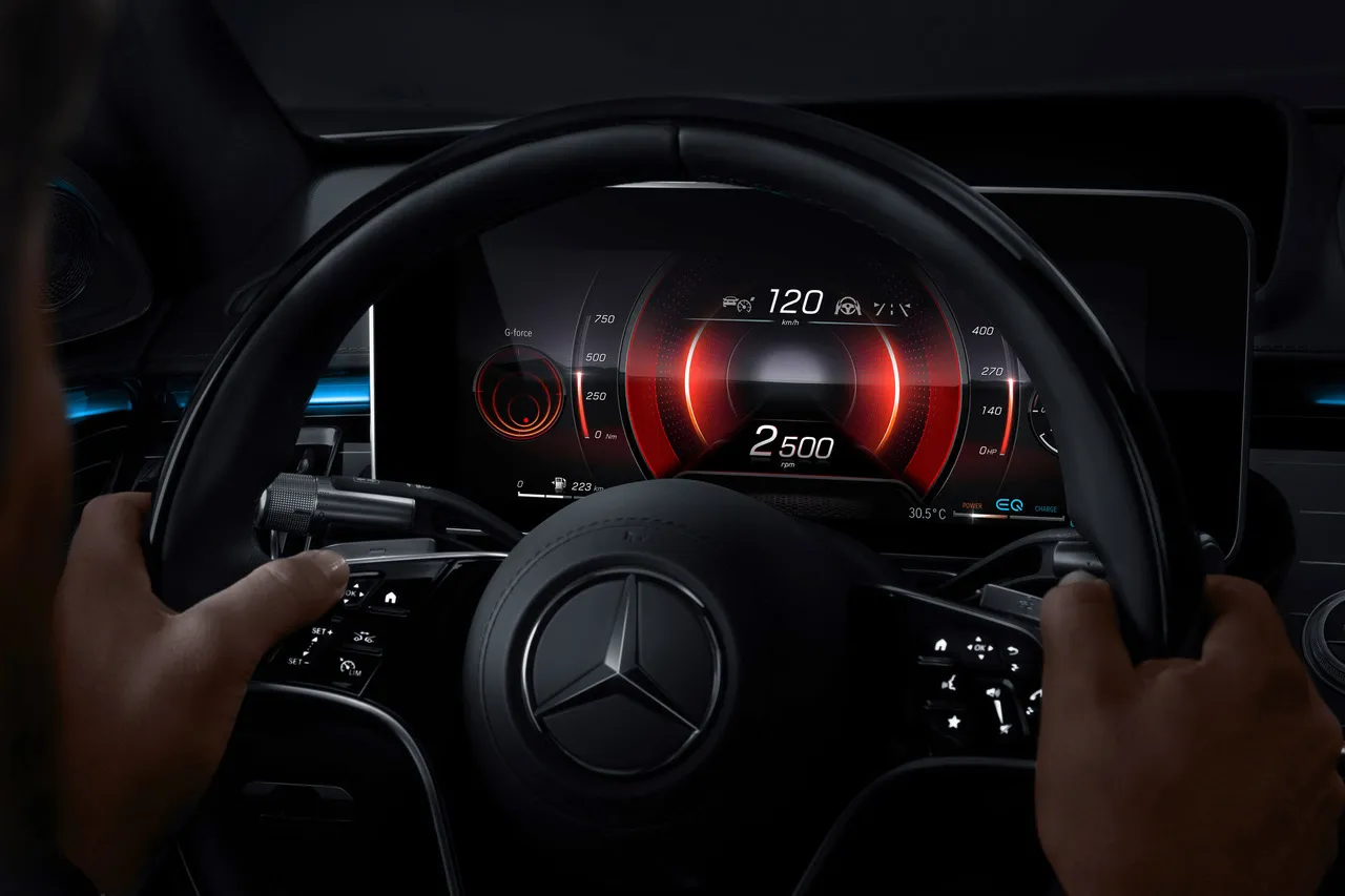
Only in sport mode, does the cluster change to something purpose-built for digital displays:
In that sense, the UI design is looking more to the past than it does to the future. Mercedes use these elements to highlight their luxury brand heritage.
It is easy to be critical of the UI style and the inconsistencies it creates. But the general approach makes a lot of sense. A flat, monochrome interface stands out in an interior with lots of different angles, reflections, and materials. Additionally, in the case of Mercedes, the interface has more touchpoints. It has to work on a center console, 3D cluster, augmented reality HUD, and rear passenger screens. With that in mind, it feels like a holistic system that is future proof. The execution, though, is not as future proof.
Lucid Air
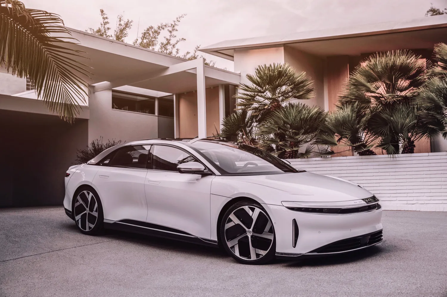
The Lucid Air is Lucid’s first production vehicle. It directly competes with the Mercedes S-Class as an all-electric luxury sedan. Compared to Mercedes, Lucid’s view of luxury is more minimalist, much more centered around the well-being of the passengers. As the first model of the brand, it has to emphasize these brand values to create a basis for the future.
The challenge of Lucid is the opposite of Mercedes. While Mercedes restricts themselves by their heritage, Lucid has no restrictions. They have to create an interface from scratch that determines the values of the brand. Lucid has not shown much yet about the interface, but enough to highlight the different views.
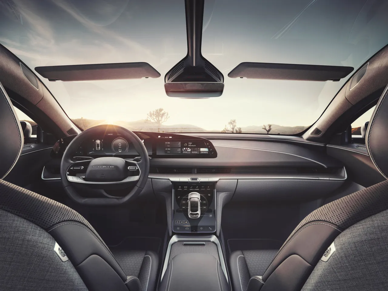
Like the interior, the interface reflects the calm, minimalist look. What you first notice is that the screens don’t stand out as much. The dark, monochromatic color scheme draws less attention to it and fits in with the interior. The gold primary color is also used in other parts of the interior. You can tell that the UX and interior designers collaborated to create one comprehensive design. The infotainment system is a part of a whole, not a feature on its own. Quite the opposite of Mercedes.
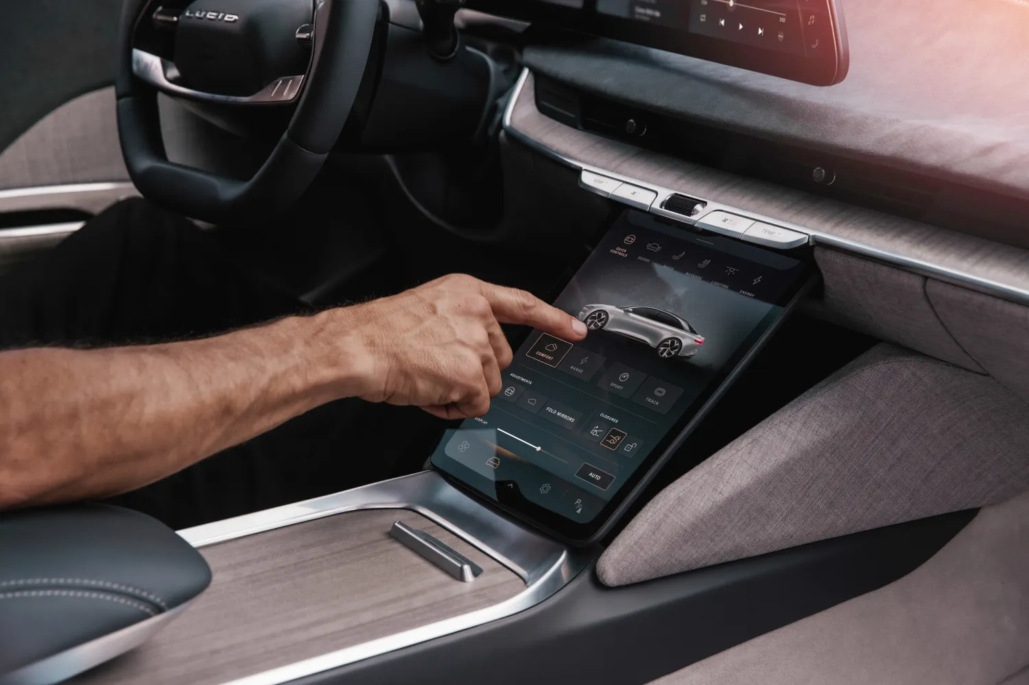
Another big difference between MBUX and Lucid’s system is the structure. At first look, the Lucid interface looks much more understandable than MBUX. Lucid uses a clear layering system. where most of the information lives in clear tabs, cards, and windows, separated by a lot of negative space.
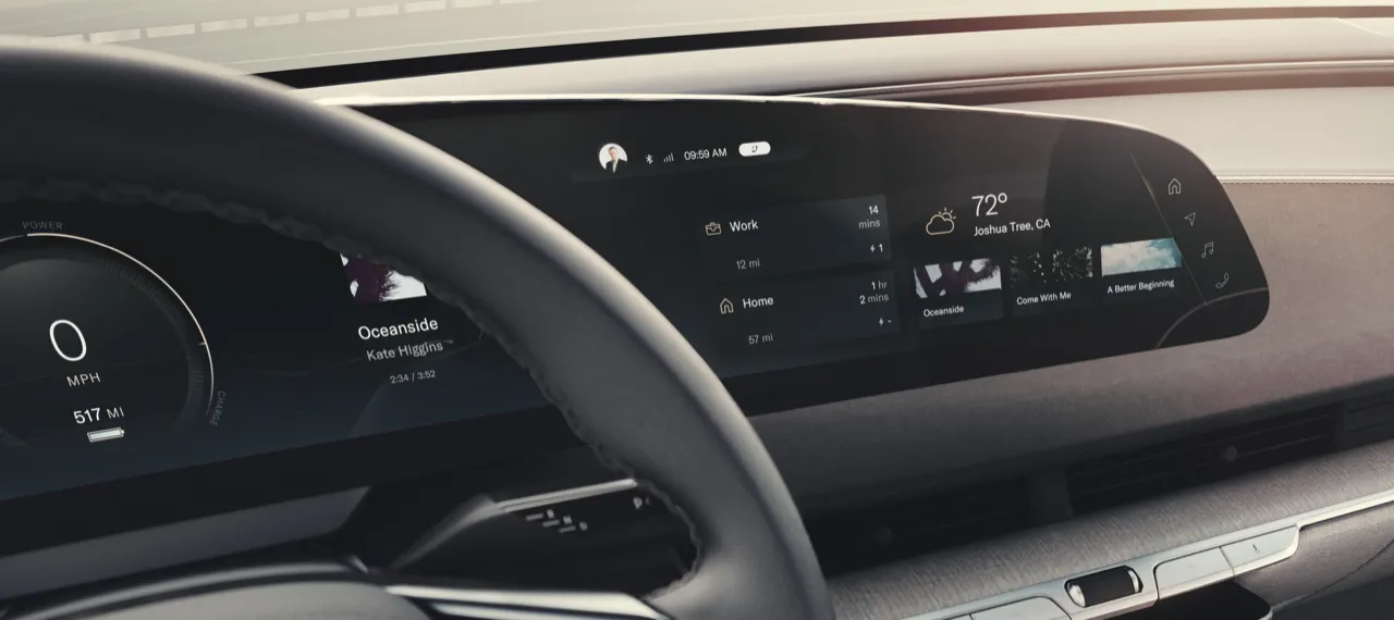
With its flat design, it is more inspired by existing popular touch interfaces. It uses familiar looking UI elements like icons, buttons, and sliders in places where you expect them to be. These elements have only the necessary decoration to communicate their function.
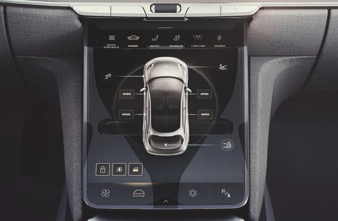
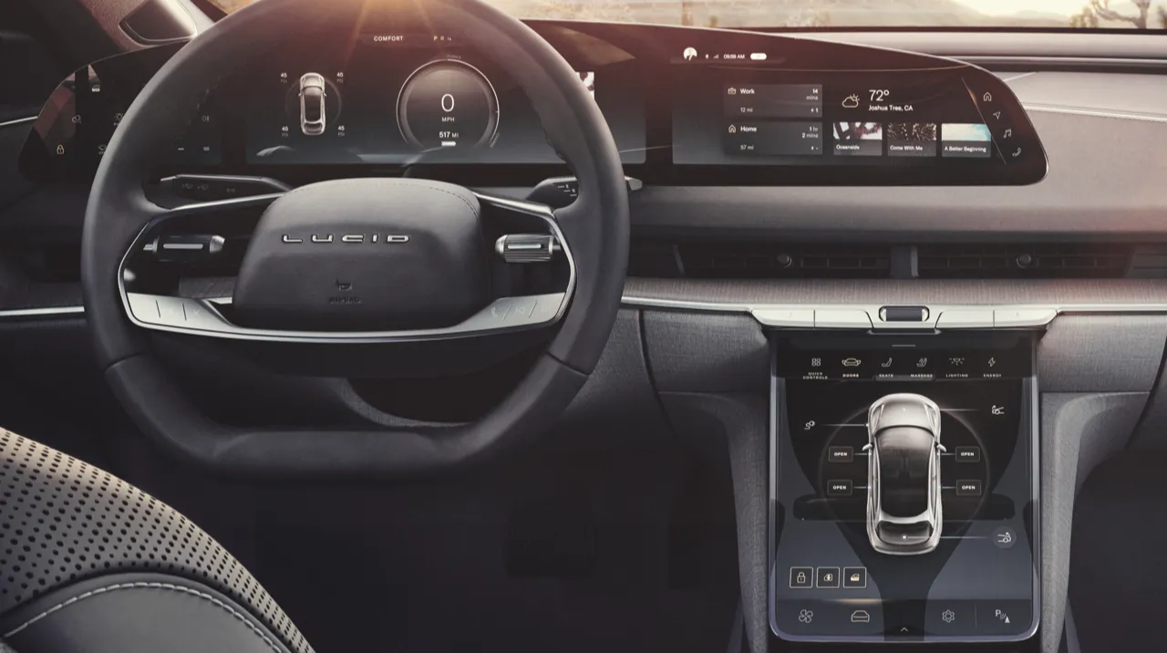
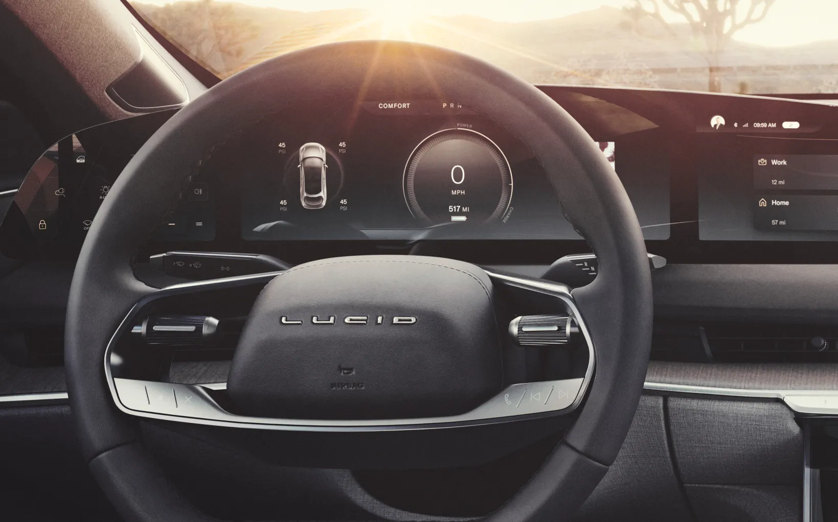
Following the minimal design philosophy, there are 3D elements only where it brings value. Without the restriction of any legacy design, Lucid uses that opportunity to create their own digital look. The speedometer is a beautifully designed 3D element.
The interface also uses a lot of 3D models of the car to show information and access controls.
By using this minimal, monochrome design, the interface operates more in the background. Still, Lucid shows off its graphics capabilities to impress its customers. An example is the charging animation.
Compared to Mercedes, Lucid has a much more conventional approach. Following contemporary design trends, it leaves a much better first impression. Unrestricted by any legacy design, it takes the opportunity to define a modern style. In that way, it sets itself apart from the established competitors. Their vision of luxury is clearly communicated through the UI design.
I love seeing this variety in UI design between brands. Both systems couldn’t be more different from each other. It is interesting to see how the UI design reflects both views on luxury. Lucid distinguishes itself from established competitors with a holistic, forward-looking design philosophy. The S-Class is more traditional, relying on a set of separate innovative features to set itself apart. Mercedes prefer to highlight their brand heritage through its interface. It will be interesting to see how these brands will develop and move closer to each other in the future.
Get notified of new posts
Don't worry, I won't spam you with anything else