Last month, Porsche unveiled the Taycan. It is the first electric car from an established car company with specs that challenge Tesla’s models. It comes loaded with new technology, there are screens all over the interior. Let’s have a closer look at the interior and see how it is designed. Generally speaking, car manufacturers have really struggled to design a user experience that is on par with the technology products that we are used to. Have Porsche figured it out with the Taycan?
The Overall User Experience
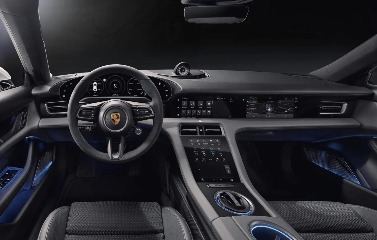
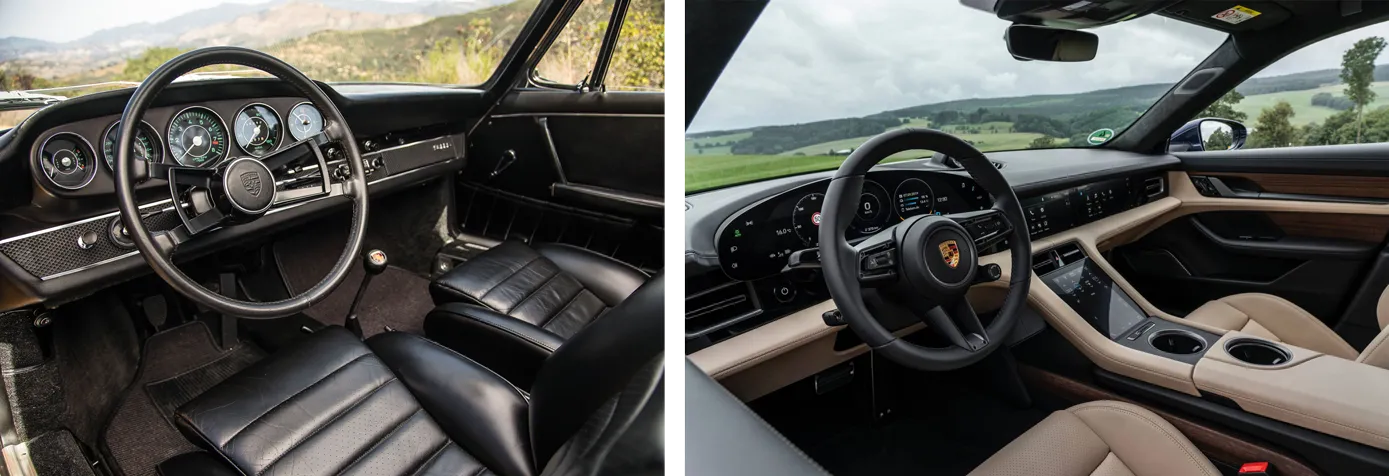
Instead of starting each design with a clean slate, Porsche builds upon existing designs, perfecting it with each generation. As a result, the materials and build quality of their interiors are among the best in the industry. Porsche designers have become experts in balancing tradition with modern technology. The Taycan is the latest reflection of this. Many of the design cues can be recognized from older models, like the full-width vertical dashboard layout. Another example is the cluster, which is a modern interpretation of the classic Porsche 911 cluster. In the Taycan, it consists of a beautiful single piece floating curved display on which the typical dials are presented.
Next to the cluster, there are 3 more screens. There is a 10,5-inch horizontal touch screen in the center console. And below it, a vertical one which also has haptic feedback. As an optional extra, Porsche offers even another screen on the passenger side which is largely the same as the center display.
The interior looks beautiful, but how is the usability? When looking at the screens, it does look like they were built to fit the design of the interior, not to give the highest usability. The center screen, for example, seems to be placed too low. The driver will have to look down quite far from the road to see the information on it. What is ironic is that the Taycan, like many other Porsches, comes with a clock mounted on top of the dashboard. This stems from Porsche’s racing history. It was placed there so that racing drivers could glance at their lap times without losing focus. Perhaps they could have drawn a lesson there.
Also, the aspect ratio of the screen seems unusual. Porsche opted for a very wide screen that fits inside the dashboard. But as a consequence, the screen is a suboptimal shape for the information displayed on it. People scan information from left to right and from top to bottom. Choosing for a wide screen means it takes a long time to scan all information, which is something the interface has to fix. On the contrary, most Volvos and Teslas use a vertical screen which seems more natural in a lot of use cases. It helps during navigation, for example, because you can look further ahead on the map. But also when designing the interface, since most touch devices we use, are vertical.
The screen below the center display mainly controls the climate control and other car functions. Using a touch screen for everything is a trend in the car industry that looks nice but is not great in terms of usability. Reaching blindly for volume or climate controls is not possible anymore. Porsche tried to solve this by using haptic feedback but that only helps with confirmation and not discoverability.
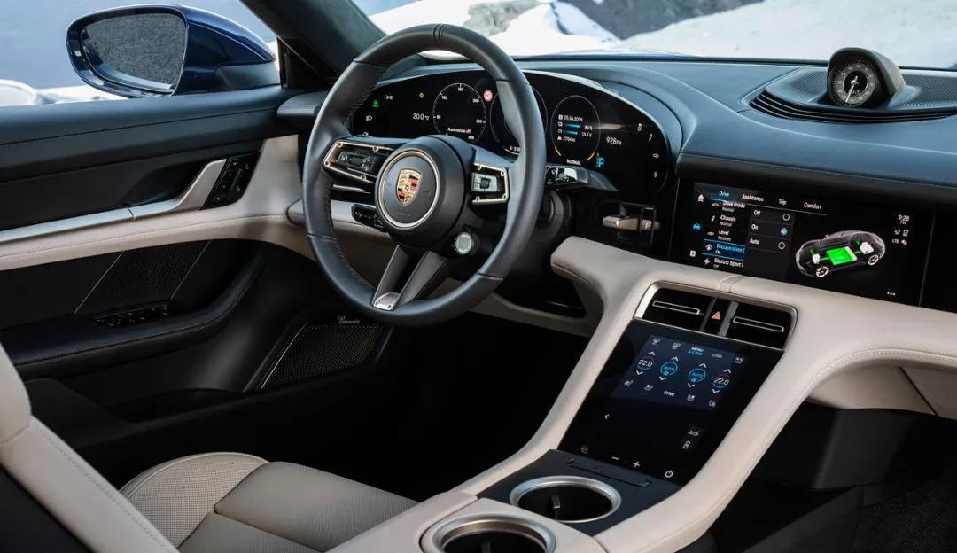
In the ’80s and ’90s, interiors were cramped with buttons. Customers like the look of touch screens and clean interiors. So now, car designers are trying to declutter the dashboard by removing all physical controls and moving them to touchscreens. It might appear like this is effective, but you are moving the problem from the dashboard to the interface so now the interface is all cluttered. The only way to declutter the interior is by removing functions and reducing the complexity. Something only very few car companies are able to achieve.
Let’s hope they will figure this out soon. Until then, we are stuck with gimmicks like the air vents in the Taycan. These can’t be adjusted by simply physically moving them. You will have to go into a menu on the touch screen and move them there. It will probably amaze people when they are trying it out for the first time in the dealership, but after having to use it in the real world, it will be less than ideal.
Fortunately, some of the core functionalities, like volume, can be controlled from the steering wheel with physical buttons. And the voice assistant in the Porsche has greatly improved and works relatively well. But still, there are a lot of examples, like the temperature control, that are easier to operate with a physical control.
A place where touch controls do work is on the cluster screen. On each side, there are 4 quick controls for the driver, like suspension settings. They are close to the focus point of the driver and can easily be reached. Choosing for touch controls is not a disadvantage here and it supports the beautiful cluster screen.
Having a screen for the passenger is a great idea. If you are traveling with a passenger, you can delegate finding a charging station, or changing the music, while you focus on driving. It seems a bit weird though that the screen is an exact copy, both physically, and interface wise, of the center console screen. The only difference is that the passenger can see a copy of the cluster interface. You would expect a different interface for a different context. If the two screens are the same, why can’t the passenger just use the center display? In its current form it is a bit gimmicky, but in the future, it can add a lot of value to the user experience.
The overall user experience of the Taycan is a great step in the right direction. The screens have a great resolution and are much more responsive than the ones in most other cars. Especially, the cluster screen is simply beautiful.
The choice of using only touch screens and the placement of them are questionable though. But they are irrelevant compared to the Taycan’s main problem. And that is the responsiveness. It is 2019 and this is a 150,000+ euro car, but the interface is slower than a first-generation iPad. Look at the video below and just observe how slow and clunky it is. You can expect this is in entry level city car, but not in state of the art Porsche.
A very bad interface that has instant responsiveness is still so much better than the most beautiful interface if it is this painfully slow. This is not only relating to Porsche, but it is an industry-wide problem.
The Interface
Now let’s look at the interface specifically. Creating an easy to operate interface is something car companies have always struggled with. Tesla has shown that it is certainly possible and car companies have been making big steps.
Interaction Design
Porsche has opted for a quite simple layout with a fixed menu bar on the left (A) and a tab bar on the top (B). It is a basic approach but it is very easy to learn and very adaptable. Users will quickly create a mental model of the basic structure of the system and they can always find their way back to the main menu when they get lost. The drawback is that it takes quite a lot of vertical space in a screen that is already a bit short. Especially since some screens even have a secondary tab bar.
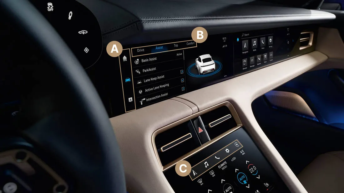
Having a fixed menu on the left is great. It is close to the driver and easy to learn since the functions don’t change. You would expect that the most used controls are placed in this bar, like navigation and music. Wrong! The menu leads to a home screen, car settings, and notifications…
The home button is the entry into the main controls of the infotainment system. There, the user can access navigation, media, and settings of the infotainment system. Also, it is possible to click the home button another time, or swipe left, which shows a configurable dashboard with widgets.
The other two items in the left menu are car settings and notifications. These notifications are grouped from the car and the user’s phone. It is quite surprising that this gets such a prominent place in the interface. Should Porsche make checking your notifications while driving so accessible? Especially because the icon shows the number of unread notifications. If you are like me and can’t stand the look of a badge icon, it would distract the hell out of me while driving and I would be forced to open the notifications screen just to get rid of the unread notifications. There will be many users who want to see their notifications and that is why it was placed there. But I wonder how ethical it is to facilitate this. People should not read their messages while driving and so it should not be placed there so prominently.
When looking at the screen below the center display, we find the climate controls and other car functions. The interface of this is simple and easy to understand. The haptics help to communicate to the driver what he is clicking but the area of the buttons is quite small. Especially when driving on a bumpy road, it will be difficult to accurately press the right button.
At the top of this screen, we find a surprise: shortcuts to launch the navigation, media, and more (C). It is great that Porsche thought of this and that they are displayed prominently. Though, the driver will have to look quite further away from the road then if they would have been placed in the center screen.
It does raise questions about the general structure of the interface. Why is there a fixed menu bar when most functions will be opened from a home screen? It would make more sense to either choose for a home screen or a menu bar, not both. And why is it possible to have shortcuts on the low screen that are opened on the high screen? When will functions be opened on the low screen and when on the high screen? In the end, the user is not impacted by this directly. But it is a bit sloppy.
The infotainment system is quite a contrast from the cluster. The cluster interface is more responsive and operated by physical buttons on the steering wheel which are quite intuitive and easy to operate. Some of the most used functions can be controlled by these buttons, like the media controls. There are a lot of possible views and widgets for the cluster which on one hand makes it a bit complex, but on the other hand, you can configure it exactly as you want. It is nice that Porsche also included a ‘minimal’ driving mode which hides most of the interface.
Visual design
The same trend continues for the visual design of the cluster. At first, it looks quite busy with many different colors and types of information. But after getting used to it, it is really good. Thanks to the high resolution of the cluster screen, the visual style can be very flat and thin. It reflects the design of Porsche: to the point and modern. With a wide cluster screen like that, there are endless possibilities of visualizing information. Porsche stayed quite conservative by still using dials in most views. It is understandable since the dials are an important design tradition of Porsche so it makes sense that they use them on the cluster in certain views.
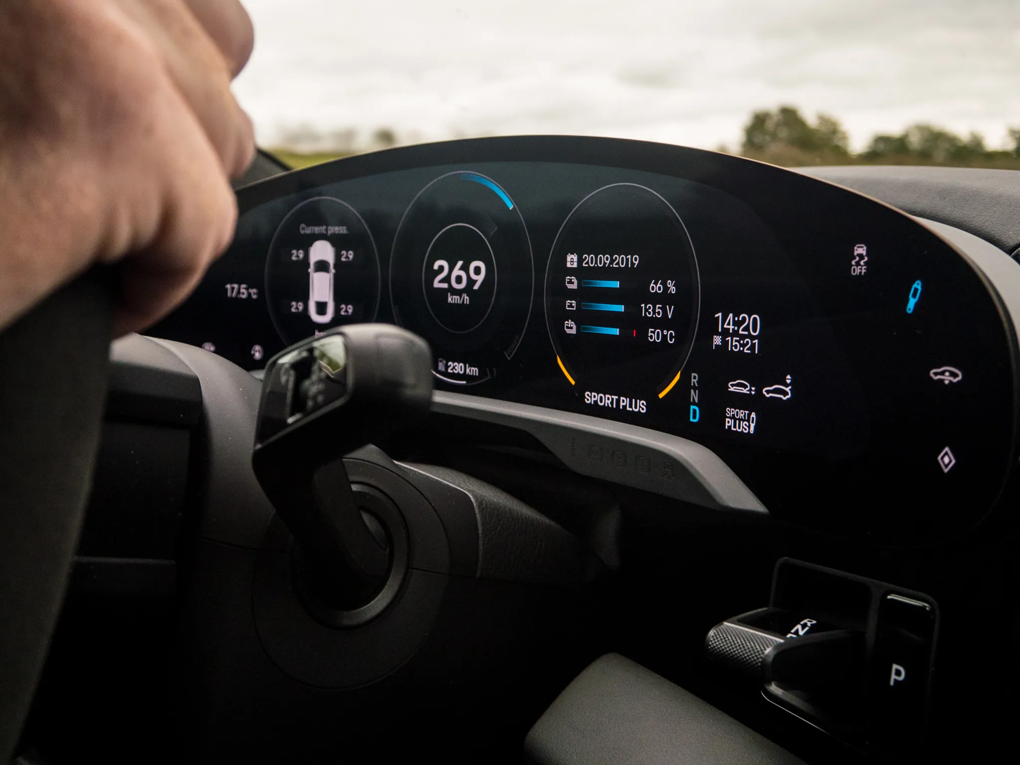
It looks like different teams worked on the cluster and infotainment system because where the cluster uses very modern visual design, the infotainment system looks a bit old-fashioned. But in the case of the Taycan, the designers might have been too conservative. On first impression, it simply looks dull and outdated. The cluster uses a very colorful scheme, but the center screen uses a dull gray on a black background with blue highlights. This, in combination with old-looking icons and gradients, make it look a bit like it came from a period when iOS 6 was still modern.
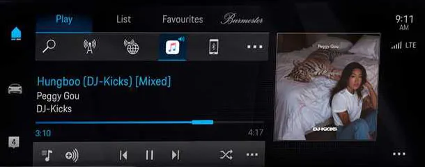
If you could remove the cluster screen from the car and show it out of context, it is clearly recognizable as Porsche design. But that is not the case for the center screen. The only way to identify the cluster is by the car settings screen. For some reason, car companies have a fetish for showing an over the top 3d animation of the car in the settings. Same for Porsche. But as a result, they managed to make a wide screen too narrow for the text. This does not only happen in car settings, but on many screens, the text does not fit and the information feels cramped.
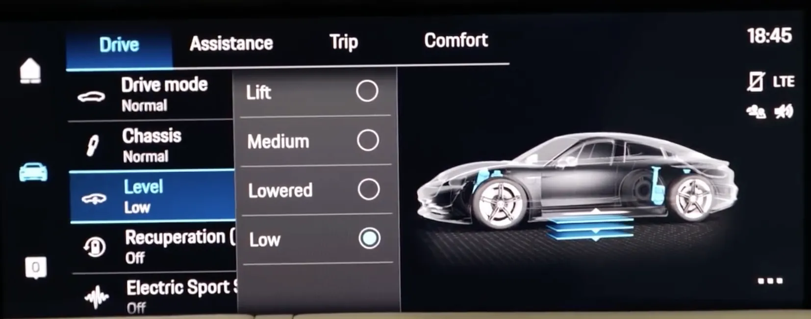
The wide screen surely does not help when designing the interface, so the designers must have had to deal with a lot of restrictions. When designing for an interface of a car, you also have to take into account that the visual style has to look modern for much longer than the average tech product. So being a visual designer for this interface is a huge challenge since you will have to judge how to visual design style will fit in in the future. Tesla has solved this problem with over the air updates. Something that Porsche will offer but it is unclear if it will be available for everyone, and if the interface will be updated as well.
The core problem of the in-car user experience has still not shown any signs of improvement with the Porsche Taycan. There does not seem to be a good balance between a beautiful interior and a usable interior. But aside from that, when looking at the screens individually, the interface design and quality of the hardware have improved a lot with the Taycan. The cluster is an amazing piece of technology with a beautiful visual design that fits the car perfectly. The interface of the infotainment system has made big steps. But it is not there yet in terms of speed and visual design. The perfect solution then is to use Apple CarPlay and wait until car makers catch up (or not).
Get notified of new posts
Don't worry, I won't spam you with anything else
