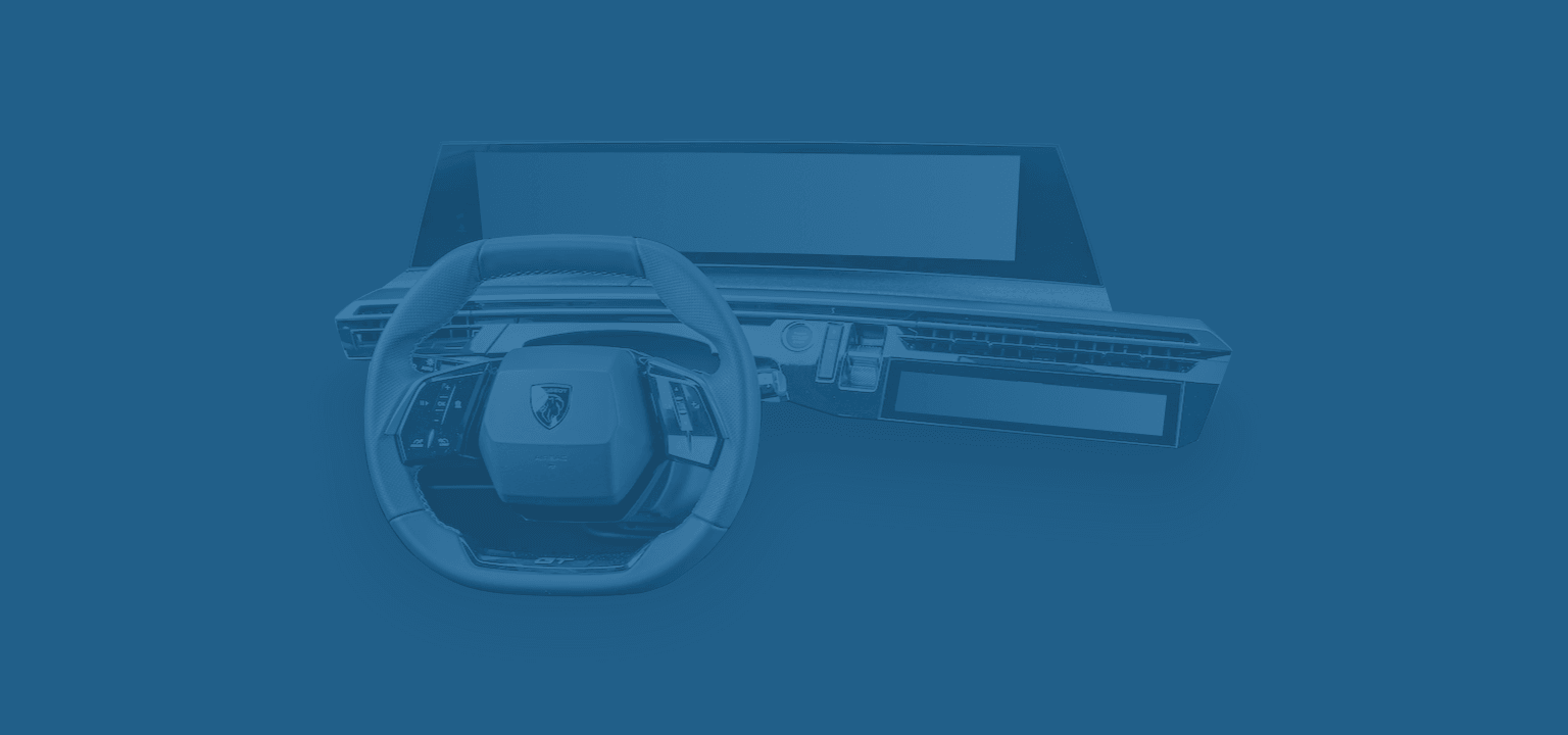
The Panorama i-Cockpit is the latest iteration of the i-Cockpit that debuted in the 2012 Peugeot 208. The i-Cockpit's main innovation is that the instrument cluster is positioned above the steering wheel rather than behind it. Therefore, it's unobstructed and closer to the driver's line of sight. The steering wheel is small, allowing enough legroom and visibility on the instrument cluster.
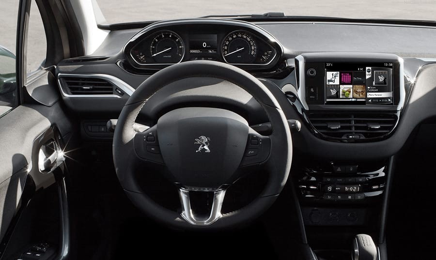
Since its launch over 10 years ago, Peugeot has been refining the i-Cockpit, and in its latest iteration, the analog instrument cluster has made way for a wide, curved display that incorporates both the instrument cluster and the infotainment system. At first glance, the hardware impresses. The industrial design is sharp, the layout feels futuristic, and the screen quality is good.
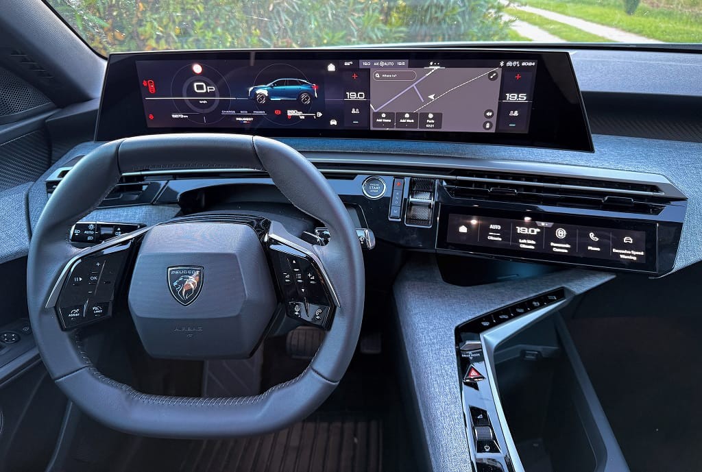
I had tried a couple of cars with the i-Cockpit before. As a tall person with disproportionally long legs, I could never find a comfortable seating position and see the entire instrument cluster at the same time. The steering wheel always ended up blocking part of it. Despite its squared-off steering wheel, the 3008 is no exception.
A clever point is that the top of the display falls about where the end of the hood is in your line of sight. So you never feel that you have to adjust your seating position to see the front of the car.
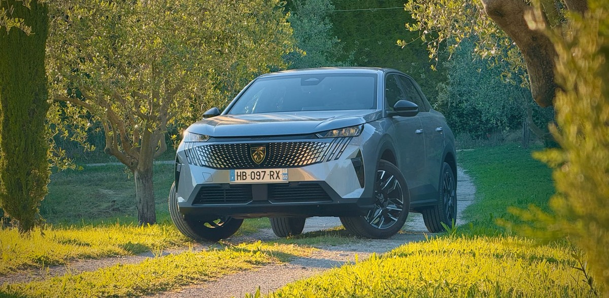
Hardware ergonomics
Seating position
Aside from my compromised seating position, the cabin is a pleasant place to spend time. The panoramic display is nicely positioned on the dashboard and easy to reach. Because it sticks out, it's easy to grab onto the display and operate the interface with your thumb. This is one of the best ways to increase the ergonomics of a touch display.
Steering wheel controls
Fortunately, the steering wheel buttons are not touch-sensitive and feature ridges to guide your fingers. The left side controls driver assistance. The right side handles media. Cruise control was a guessing game at first. For example, the button to re-engage cruise control isn't labeled intuitively.
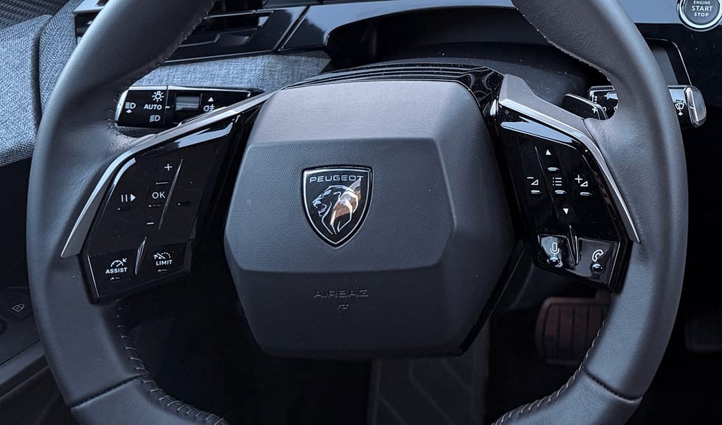
What also confused me repeatedly were the media playback buttons. If four buttons can be assigned, it seems evident that raising and lowering volume is controlled by the up/down buttons, and the music playback controls by the left/right buttons. However, Peugeot decided the opposite.
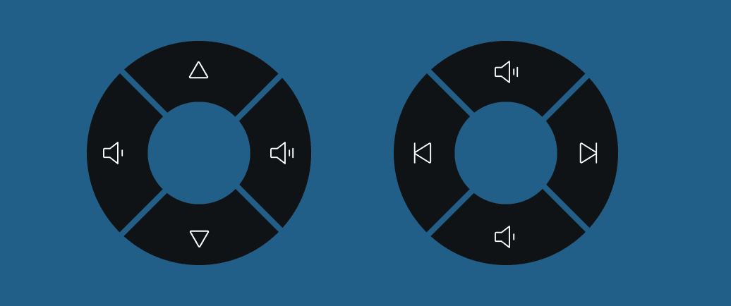
To make it more confusing, the music playback icons are up/down arrows instead of left/right arrows. This then raises the question, is the down arrow the next song as you go down the playlist, or is it the previous song as you return to the beginning?
Gear selector
Gear selectors are a favorite topic of mine because, much like door handles, it's a solved problem, but carmakers can't stop re-inventing them. However, the 3008 has a clear gear selector.
It's nice that you can skip steps with more aggressive pushes and that you can always go into Park from any gear by pressing the button. The one oddity is that it is not possible to go from Park to Reverse in one movement, as you always have to move the lever down to Neutral and then up to Reverse.
Displays & Software
The main display is a one-piece 21" panorama wide-screen. The left half is dedicated to the instrument cluster, and the other is driven by the infotainment system. The quality of the display is great for the car's price class. It's sharp, and the black colors are dark enough.
The main new feature of this latest generation of Peugeot vehicles is the i-Toggles. This rectangular touch display next to the steering wheel displays 2 pages of 6 configurable tiles.

Let's go through the displays one by one.
Instrument cluster
Drivers can choose between different instrument cluster views. You can add or delete views and customize the information on them.
Aside from the map, the views all show a combination of speed and power data. Most have pretty complex graphics that are hard to interpret. Because of my seating position, the minimal view was my go-to option as it placed most content above the top edge of the wheel.
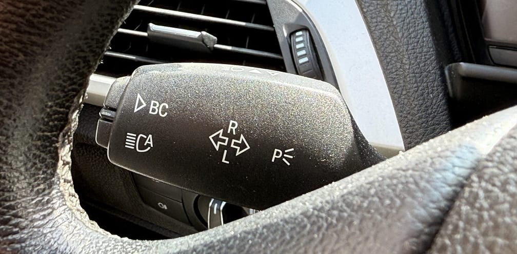
When I picked up the car, the active view was the map. I genuinely thought that this was the only view, as I could not find a way to change it. It was only after arriving at my final destination and pressing every button that I discovered that the one at the end of the wiper stalk was for changing views. There is no icon or explanation for it on the stalk. In fact, I thought the intention of the button was to control the brights as there is an icon right next to it.
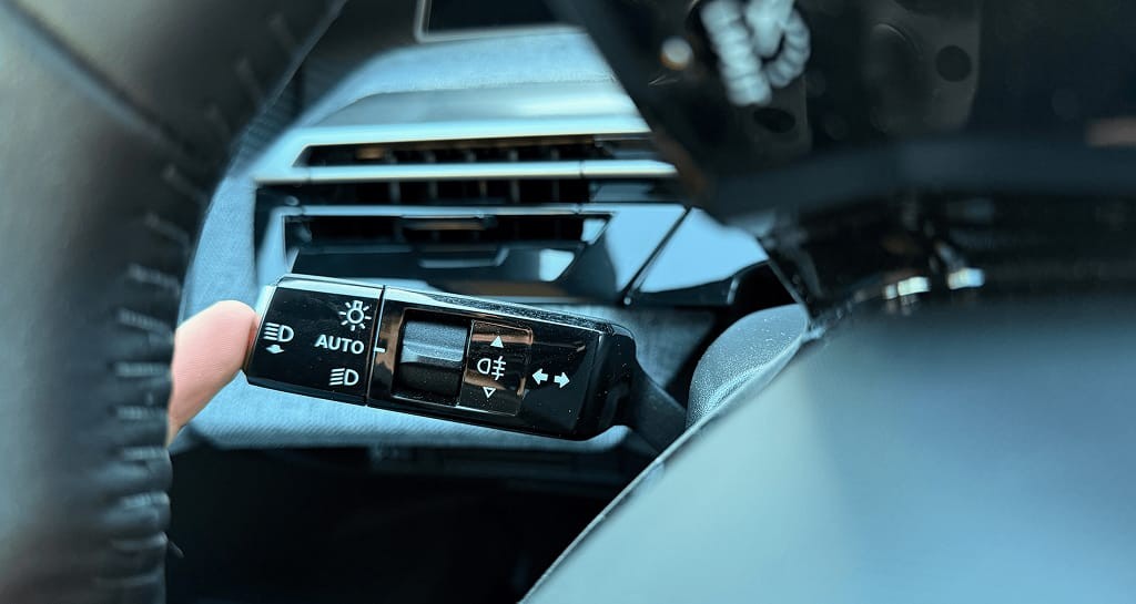
Compare this to BMW, where the stalk has a label with a clear arrow to indicate the same function.
The placement of the instrument cluster close to the line of sight is especially interesting when using the map view. I mostly used Apple Maps in CarPlay, which can be displayed there thanks to the deep integration.
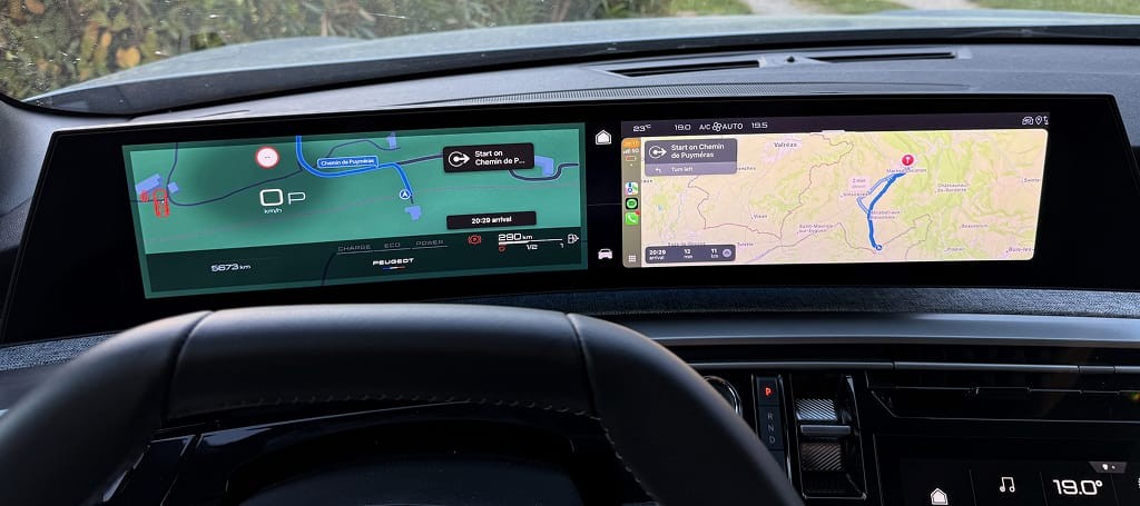
Not having to look to the right to see where you have to go takes some getting used to. But once you do, having it so close to your line of sight is pleasant. It also means that you can have two apps open at the same time in CarPlay.
However, Peugeot could have refined the black gradient behind the speed, as it does not look good.
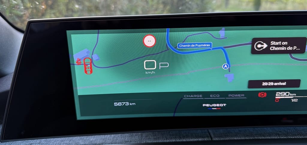
One thing my designer brain immediately noticed after setting off is that the instrument cluster is not horizontally centered in relation to the steering wheel. It is slightly offset to the left. This isn't a problem per se, but then the information is centered in a display that isn't centered. So, when using the minimal view, the speed is slightly to the left of the center of the steering wheel.
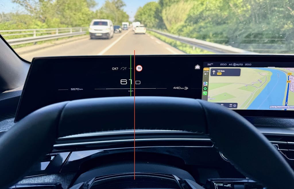
Moreover, because the designers chose to horizontally center the speed together with the currently selected gear ('D'), the speed is also off-center within the instrument cluster.

Decreasing the gear indicator size and horizontally centering only the speed is a better solution.

Throughout the entire system, Peugeot uses quite expressive animations. However, in the instrument cluster, I found them too distracting. Each message is accompanied by this animation. It immediately draws your attention, but it takes too long for the 'appear' animation to finish before you can read the information.
Aside from these minor issues, the instrument cluster interface is excellent. Interface elements are clear and easily readable, and I also like that the background color is black, making it comfortable when driving at night.
Infotainment
Compared to other brand's infotainment systems, Peugeot's does not have a lot of functionality. There are only a handful of 'apps', and all are simple. That is not a bad thing, though. In fact, most carmakers go overboard with the number of functions.
For example, many cars have configurable drive modes and settings like regenerative braking. This Peugeot doesn't, which isn't a problem, as the engineers did a great job configuring it. If they had added a way for me to choose the strength of regenerative braking, it would not have added much value.
What is unusual for a car in 2025 is that no third-party services are available. So even though there is a native navigation system, I never used it because I immediately connected to CarPlay to have access to my music and podcasts.
Information architecture
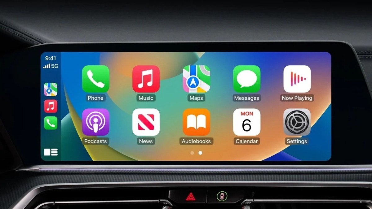
When designing an infotainment system, one of the main questions is what you want to display on the 'home screen'. There are two options. You can make 'home' an app, like navigation. Or, like most smartphones, you can make the app grid the home screen.
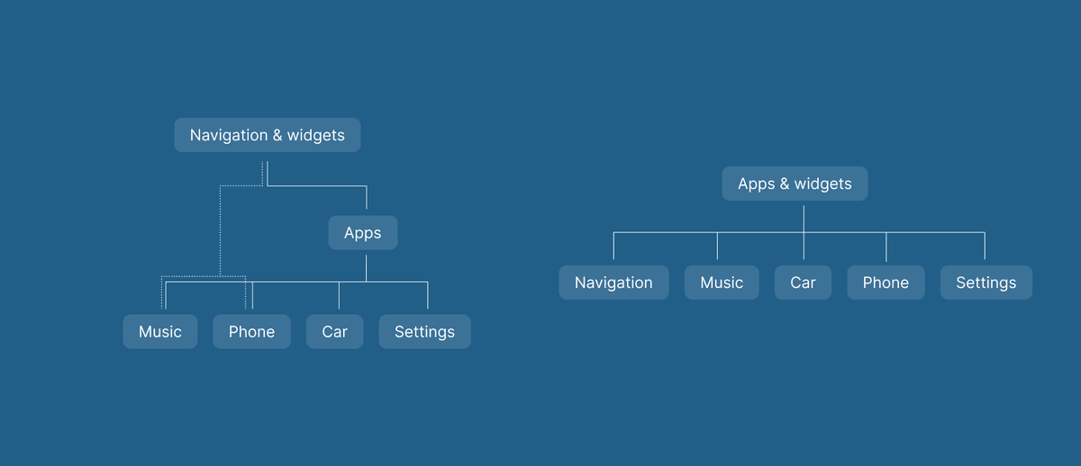
This decision impacts the information architecture of the system. It's simple if the home screen is the app grid. Each app opens in the first layer, and you return to the grid with a home button. This results in a calm-looking home screen, often with a few widgets for core information. But it means you must open an app for each more complicated action.
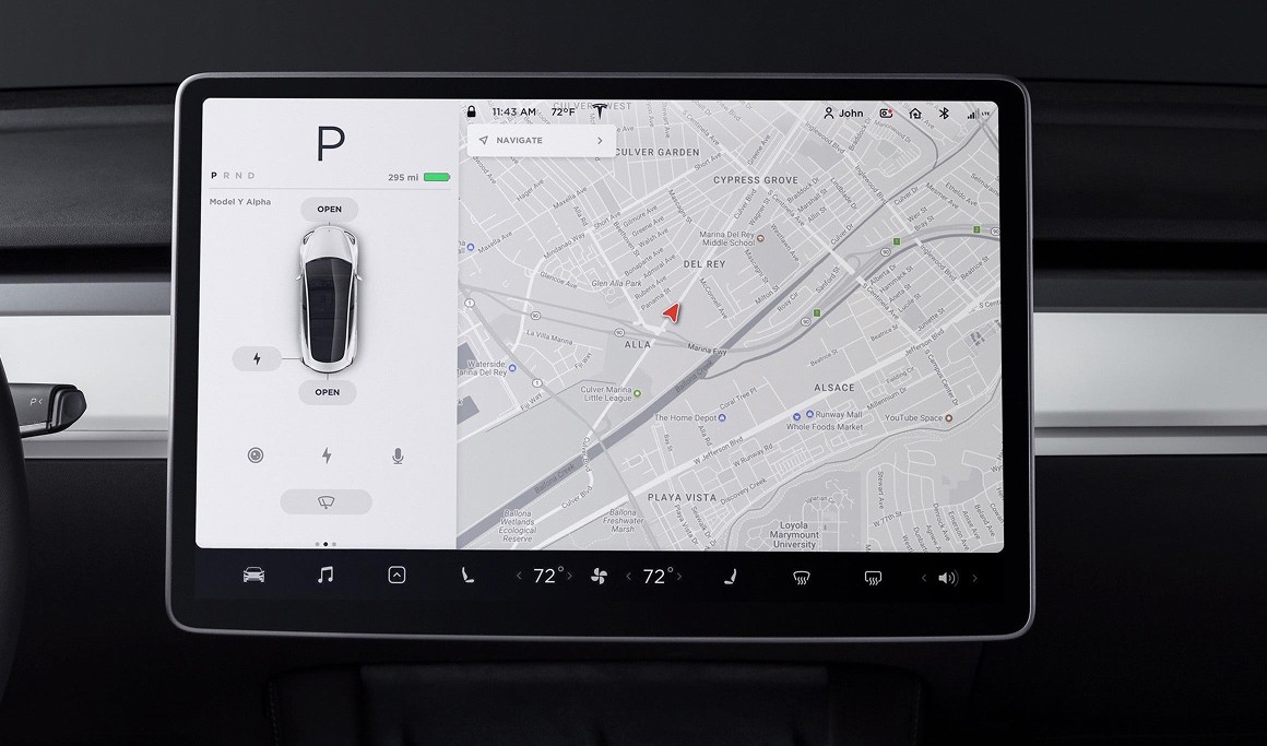
On the other hand, if navigation is the home screen, there is less context switching. But there is an extra step to open the app list first and then select the desired app. Therefore, you must add a button for the app drawer in addition to the home button. The information architecture is therefore more complicated.
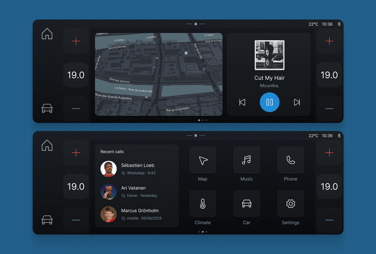
Peugeot decided on an in-between solution that makes the home screen unnecessarily complex. By default, there are three pages filled with widgets and app icons. The first page has temperature controls for the driver and passenger on either side and a large map widget in the center. The second page has the same temperature controls but with the media player instead of the map. The third page again has temperature controls, but the middle is filled with a smaller media widget and app icons.
The idea behind it is that drivers can design their own home screen. You can add or remove pages, and every widget and app icon can be removed or replaced. It's an odd decision when considering the two possible architectures. You don't get the advantage of having the full navigation app in the background, but you also don't get all app icons. To do so, you must tap the app drawer icon on the third page.
Peugeot could have made the system simpler by going for one specific information architecture. For example, by moving the temperature controls to a fixed location and designing the home screen around app icons and widgets.
Through the widgets, Peugeot can offer the same level of configurability but in a simpler interface.
App layout
Most system apps, like climate controls and settings, have the same layout. They feature a scrollable list of categories on the left with the main content on the right.

Additionally, there is a column in-between those in each app. It includes a 'hamburger' icon, which is universally used to open a menu, but here, it collapses the list of categories. I could not find a single use case for this. In a few apps, the column does have a couple of quick actions which can be useful. But they can also be placed somewhere else. The space of that column would have been better used to increase the width of the category list and make it easier to reach.
Given that my car did not have many options, the category list in the climate app had just one entry. Surely, it's not challenging to add logic to remove this and give more space to the climate controls.
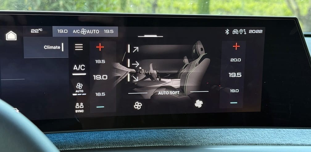
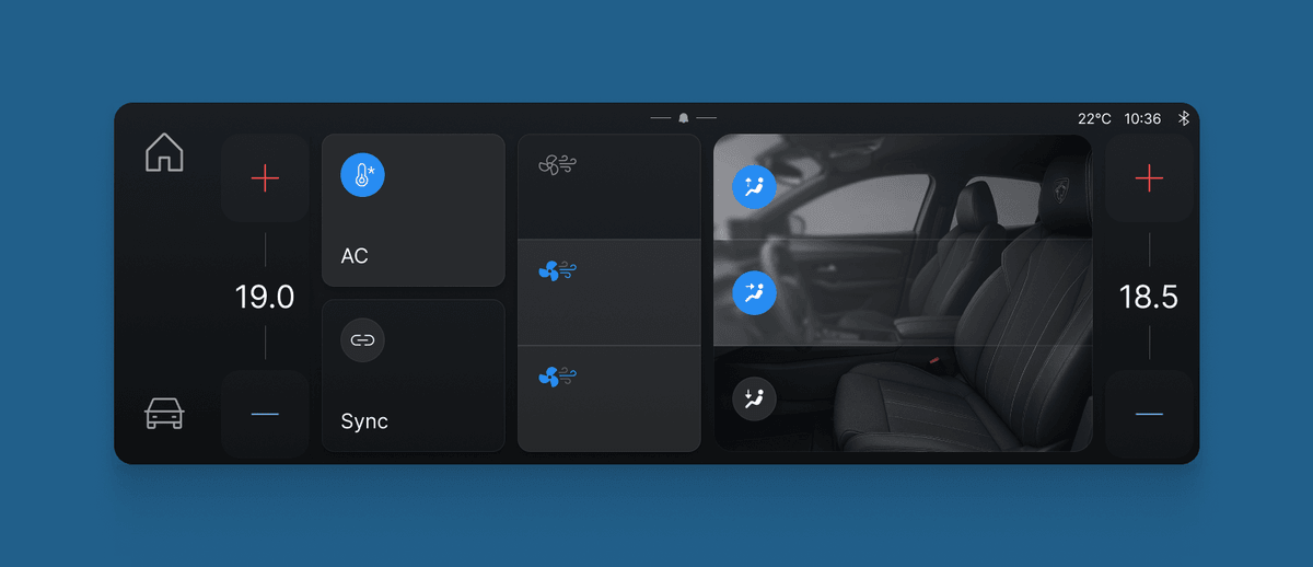
There are other aspects of the climate app that could have been refined. The temperature controls are not centered in their container and the plus and minus buttons are too close to the edges. There are also no clear affordances for any interactive elements. Are you supposed to tap the temperatures, swipe, or both? And where do you tap to disable the airflow for the feet?
With better organization and more focus on clear touch targets, the climate screen becomes much easier to understand.
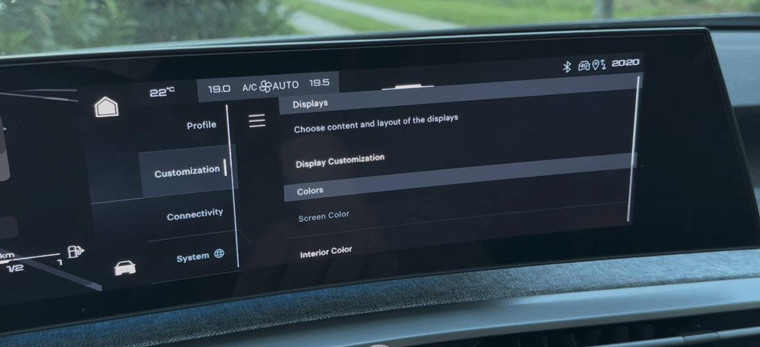
The climate app is no exception, as the same lack of polish is present on almost every screen in the system. For example, in the settings app, the scroll bar sits on top of the categories instead of next to it.
Animations seem to appear with a disappear motion, and I am still not sure if this is intentional.
And the divider line that goes through the system is off by one pixel.
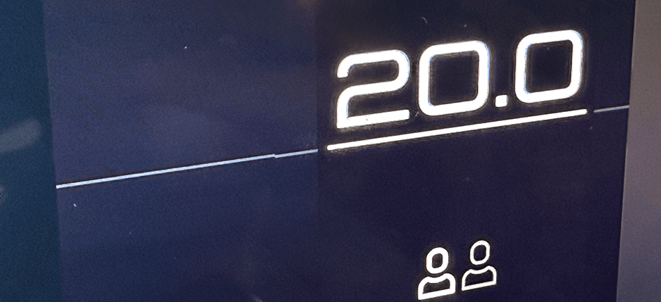
These are only a couple of random examples. There were few screens where I did not find quality issues that should have been caught before release.
Updates
Handling software updates is a challenging design problem. From my experience, it is also something designers overlook or are not involved with. It seemed to be the case for Peugeot as well. On two occasions during my week-long trip, a software update was released. Both times, the notification was shown while driving. First, there was a notification that an update was available, and then there was one that the update was downloaded. In both cases, it was more distracting than it was useful. This information is important to me when I enter or leave the car, not while driving.
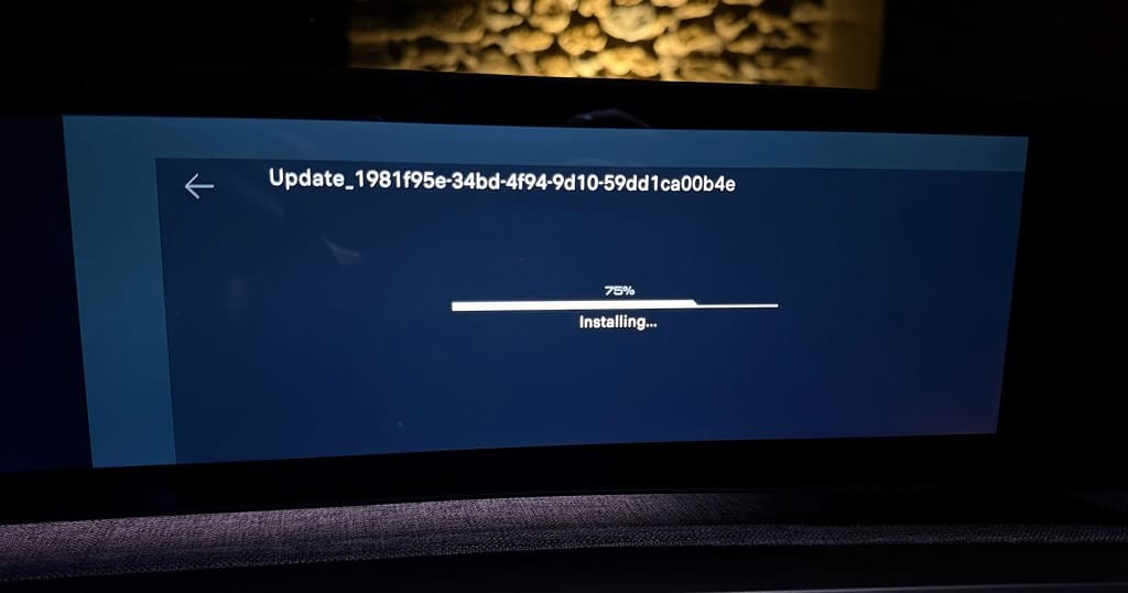
Then, upon parking, a popup showed up asking me if I wanted to install the update. It gave no information about what was being added or fixed. Similarly, during the installation, the screen only showed a random string. This is a missed opportunity. I would love to know what software is changed in the car, even if it's just bug fixes.
i-Toggles
Aside from the panoramic display, the second addition to the i-Cockpit is something called i-Toggles. This is a touch panel with two pages of 6 tiles. Each tile can be an app icon or a shortcut, and drivers can choose any 12 functions they want.
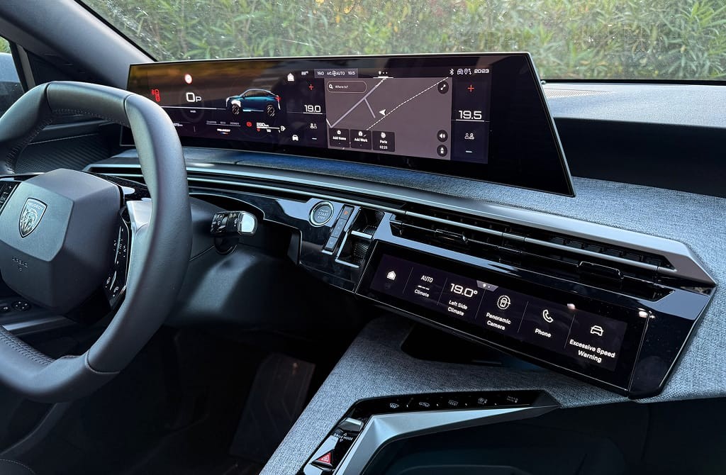
I really love this idea. The display is in a place that is easy to see and reach. Using a touch display is an excellent choice as it allows for configuration. To mitigate the downside of touch displays, the tiles are big.
I chose a shortcut to Apple CarPlay and the speed limit warning toggle. I also added the auto fan speed to adjust how fast the car would cool down. It avoids a lot of otherwise complicated interactions with the infotainment system and ensures you don't have to exit CarPlay in many cases.
The extent of what you can add is also impressive. Seemingly, every button or setting in the infotainment system can be added as a shortcut. However, configuring the tiles is a challenge. And this is a recurring theme in the car.
Customization UX
The main feature of the infotainment system is its configurability. You can choose the number of different cluster views and what is in them, decide how many pages there are on the home screen and what is in them, and choose the 12 i-Toggles. Unfortunately, the interaction of configuring each display is by far the most frustrating part of the entire system.
Center display
Both the cluster and central display have the same configuration UI. You toggle it via a long press. I started with the central display, tapped 'add a widget', and saw a popup saying there was no available space.
I then tapped the trash icon to see if I could delete one, and I was met with a popup saying I needed to drag and drop a widget on the trash icon to delete it. What followed was a couple minutes of me trying to drag a widget to the trash icon and failing.
It turns out that you have to tap and hold a widget for a second and then drag it because the swipe gesture would otherwise be shared between the drag-and-drop and the pagination. There is no indicator explaining that. Adding an 'X' button in the top right corner of the widget would have been a much simpler solution.
Other aspects could also be improved with easy fixes. For example, functions like the app drawer icon can't be deleted due to the unusual information architecture. However, the icon does have an outline suggesting that it can be removed. Only after dragging it to the trashcan does a popup inform you that it's impossible. This can easily be prevented by hiding the outline.
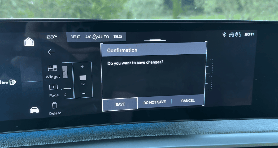
Another example is the flow to save your setup. To do so, you have to press the back arrow. This triggers a popup with save, do not save, or cancel. This doesn't follow basic design principles. A back arrow works if changes are saved automatically. But if they aren't, it's better to show explicit 'save' and 'cancel' buttons.
Instrument Cluster
The same configuration flow is used for the instrument cluster. It's easier to interact with it as there is only space for two widgets. However, scrolling through the list of available widgets is incredibly frustrating as there is only space for about 1,5 rows on the display, and each snaps to the top.
I also found it difficult to understand what each widget does, as the only explanation is an icon. I would have preferred a small preview of the widget.
i-Toggles
By far the most unintuitive of all are the i-Toggles. For the other displays, you tap an empty slot and choose the widget you want there. So, I did the same when I tried to configure the i-Toggles. However, upon long pressing a tile, the center display only highlights the replacements from the currently opened app. So if the navigation app is open, and you long press a tile, you only see the functions from that app. To explore all the available tiles, you would have to go through every single screen of the infotainment system, and for each, long press a tile to see what you can replace it with. It's totally unintuitive.
When playing around with this, I replaced my Apple CarPlay shortcut with something else. I then had no idea where to go when I wanted to revert it. After searching for a bit, I saw that I had the 'mirror screen' app tile on one of my home pages. With this page active, I long-pressed a tile. The mirror screen tile appeared available for a second or two before showing an error message. This looks like a bug.
This wasn't the only bug I encountered. Like the rest of the system, most screens had issues that should have been caught before production. For example, the two available i-Toggle functions of the navigation app are shown in a popup with missing label spacing and an unnecessary scrollbar.
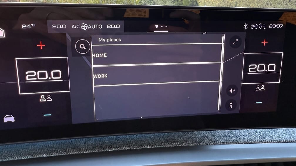
When scrolling and reaching the limit of a list, it jumps back to the last position without an animation. And every action triggered a confirmation popup, which was unnecessary and obstructive.
Most of these issues are minor. But the configuration flow for the i-Toggles isn't. It's a shame because it is a fantastic feature. Part of the appeal is that you can explore what is available, and if they had used the same structure as the other configuration modes, it would be much easier.
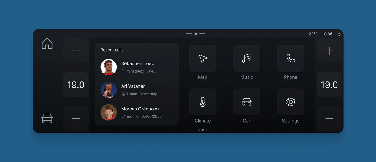
I didn't find the configuration of the instrument cluster and home screen as useful as the i-Toggles. I could easily do without it. I expect this feature is primarily relevant for cars without the i-Toggles, as the functions mostly overlap. However, there is an opportunity to offer different content on the home screen than the i-Toggles. It lends itself well to more elaborate content than the i-Toggles can handle, such as a phone widget with my recent calls.
The underlying issue
I love it when carmakers take risks and try something new, especially if it's not just a gimmick. The i-Cockpit is such an example. With the panoramic display, Peugeot is punching above its weight. It is a nice interior to be in and very well thought-through. Unfortunately, the software is not up to that same standard.
The last thing I want is to come across as an uninformed designer who gets an easy hit by bashing a product without understanding the challenges around it. It's very easy to criticize designs, which is why this is only the second review on my blog. In my career so far, I have been fortunate enough to have been working at, or for, several large carmakers. In recent years, much of my work has focused on helping carmakers improve software design and development. I have had first-hand experience with the problem of software development from many different angles, from board rooms, to design studios, and final delivery. Explaining why software is like this is a long, complicated story (one that I have been writing for a long time).
At the same time, it should not be an excuse. Peugeot's infotainment system has a solid foundation, but the software design and quality have issues that should have been fixed before production. The good thing is these can be fixed with over-the-air updates. If Peugeot does a few more iterations to improve the configuration flow and fix the visual bugs, the software should be much closer in quality to the excellent interior Peugeot has created.
Get notified of new posts
Don't worry, I won't spam you with anything else
